Glenfiddich is the brand of the world’s best-selling single-malt whisky, first produced in 1887 by William Grant in Dufftown, Scotland, Glennfidich — which means “Valley of the Deer” in Scottish Gaelic.
Meaning and history
The Glenfiddich logo consists of two parts: a graphic one – a stag head, and a wordmark.
1968 – 2007
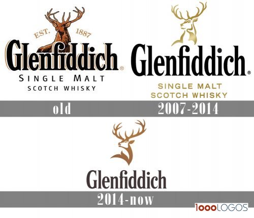
The stag here denotes masculinity, power and confidence. This icon first appeared on Glenfiddich bottles in 1968, and has remained unchanged until its last redesign in 2007. The new design simplified it and made it more anatomically correct.
2007 – 2014
The redesign of the Glenfiddich logo, held in 2007, kept the idea and main symbols of the previous version but redrew it in a modern way. The image of the deer was now stylized and executed in gradient gold lines, looking extremely chic and sophisticated. The nameplate was also changed — its black letters featured a narrow serif typeface with thick smooth lines and small sharp serifs on their ends. As for the “ Single Malt Scotch Whisky” tagline, it was set in all capitals of a confident new strong sans-serif typeface, executed in the same gold shade as the image of the deer.
2014 – Today
As for the wordmark, it’s executed in Glenfiddich Modern – pioneering font fit, inspired by the Glenfiddich logotype, which has over 50 years of heritage. It’s a modern interpretation of its fine and sharp serifs. Glenfiddich Modern is confident, clean, unique, premium and crafted.
Designers chose a copper color palette, which is called Pagoda Copper. Secondary colors are New Make White (adds freshness and a more contemporary feel), and Fiddich Stone, inspired by the granite that was used on William Grant’s original warehouses.


