Nestea is a soft drink brand, created in 1948 by Nestle. The beverage is a flavored ice-tea, produced in several variations. The label is widely recognizable and distributed across the globe, being a joint venture of two powerful companies — Nestle and Coca-Cola.
Meaning and history
Nestea, the world’s most famous brand of ice tea-based beverage, has been present on the international market since the middle of the 20th century. The label, created in Switzerland, today is a joint venture between two world’s most influential companies in the food segment, Nestle and Coca-Cola.
The alliance of these two international groups is known as Beverage Partners Worldwide, or BPW, which was created at the beginning of the 1990s, and is headquartered in Switzerland.
What is Nestea?
Nestea is me of the Nestle brand, which was established at the end of the 1940s. The brand represents a soft flavored beverage, based on an ice tea. Today there are several Nestea flavors available, including lemon and peach, and some seasonal modifications, which vary from country to country.
1950 – 1960
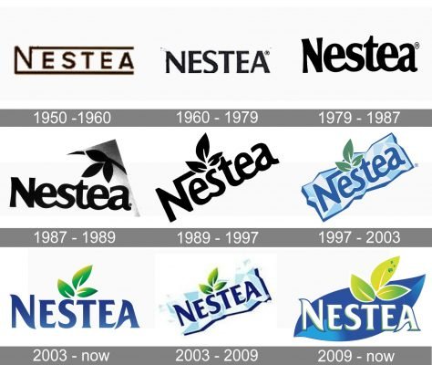
The original Nestea logo was designed in 1950, based on the Nestle logotype with elongated horizontal tail on the letter “N”, going above the whole inscription, which was also underlined.
1960 – 1979
In 1960 the brand changes its logotype’s typeface and all capital letters gained a bolder and more modern silhouette.
1979 – 1987
The redesign of 1979 brought a smooth and rounded font to the logo while in 1991 the three-leaf emblem was added.
1987 – 1989

The redesign of 1987 made the Nestea lettering wider and more balanced, and now the bold black inscription was accompanied by a delicate emblem on its upper right corner. The emblem depicted three leaves, coming out of one arched line. This showed the natural plant concept of the brand’s beverage and its flavors.
1989 – 1997

In 1989 the logo was rewritten and placed diagonally, in the upright direction. The main change was about the letter “N” which got its right bar elongated and bent to the right, making a strict angle. The emblem with three leaves pointing up was placed at the end of the “N” bar, softening it and adding friendliness to the whole badge.
1997 – 2003
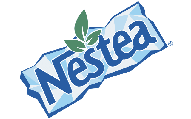
The redesign of 1997 made the logo from 1989 colorful. Now it was a blue logotype in a thin white outline, placed on a stylized banner with a texture of an ice-cube, executed in geometric figures of two shades of blue. The only “non-blue” element of the badge was the three-leaves emblem, which was executed in solid green and perfectly balanced the whole composition.
2003 – Today
In 2003 the Nestea logo became colorful. The blue wordmark was placed on a light blue background, resembling ice and the three-leaf green emblem was located above the letter “S”.
2003 – 2009
The new typeface for Nestea was created in 2003. The font, based on Friz Quadrata Bold or URW Agenda, has smooth curved lines and looks sleek and modern.
2009 – Today
The current Nestea logo is composed of the lettering in the typeface from 2003, placed on a blue-leaf background with the light green emblem above the letter “T”.
The white wordmark has a blue and green outline, which adds a friendly feeling and makes the logo look fresher and more eye-catching.
Font and Color
The elegant contoured uppercase letter in g from the primary logo of Nestea is set in a custom serif font with playful ends of the bars. The closest fonts to the one, used in this insignia, are, probably, Revans Semi Bold, or Majesty Bold, but with some significant modifications.
As for the color palette of the Nestea visual identity, it is based on a combination of blue and green gradients, supported by white elements, which add freshness and lightness to the composition. The color scheme of the logo reflects the “nature-based” ingredients of the beverage and makes the brand look friendly and healthy.


