WarnerMedia is a large entertainment company, which was established in the United States in 1972 under the name Warner Communications. Today WarnerMedia owns more than a dozen of super successful brands in all spheres of communication, it the company’s portfolio there are such loud names as CNN, HBO, and DC Comics.
Meaning and history
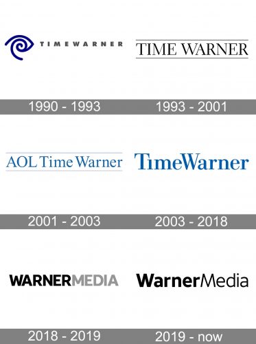
The visual identity of the large entertainment conglomerate has changed a lot throughout the years, but it was mainly connected to the name changes of the company, as it merged with other brands several times throughout the years.
1990 – 1993
The very first logo was created when the company was called Time Warner. The badge featured a bold sans-serif inscription with both parts of the company’s name in the uppercase gray letters, with no additional space in between. The logotype was set on the right from an abstract blue emblem, which resembled an eye with a simple swirl inside.
1993 – 2001
In 1993 the logo of the conglomerate was redesigned by Anspach Grossman Portugal bureau, and now it hosted a simple yet extremely elegant serif inscription in the uppercase, placed between two black horizontal lines. This badge stayed with the company for eight years and was a brilliant representation of solidness, stability, and a good reputation of the brand.
2001 – 2003
After another merger, the name of the company was changed to AOL Time Warner and the logo was redesigned respectively. The new badge featured a simple blue inscription in a serif typeface, with the “AOL” in the uppercase and only “T” and “W” capitalized in the “Time Warner” part of the wordmark.
2003 – 2018
The name of the company became Time Warner again in 2003, and the new logo kept the blue and white color palette of the previous badge, though made the blue darker and more intense. As for the inscription itself, it got its lines strengthened and contours slightly enlarged, though was still executed in an elegant and traditional serif typeface. The additional space between the two parts of the company name was removed.
2018 – 2019
In 2018 Time Warner is being renamed WarnerMedia and the visual identity is being redesigned again. The new badge features a bold and brutal sans-serif inscription in the uppercase, where the “Warner” part is set in black, and “Media” — in gray. The clean contour and thick lines of the letters look very similar to such a font as AT&T Aleck Sans.
2019 – Today
The redesign of 2019 kept the typeface from the previous version, but completely changed the style of the WarnerMedia logo. Now both parts of the inscription are written in black color, but the “Warner” part uses a bolder type, while the “Media” is executed in thinner lines. Another important change in the logo is that now both wordmarks have only their first letters capitalized. This way the logo looks more elegant and friendly but doesn’t lose its confidence and power.


