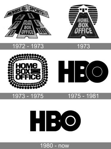
The US television network Home Box Office has gone through two distinctive logotypes, which reflected the changes in the company’s status among its competitors.
Meaning and history
The oldest pay TV channel in the world, HBO, went on the air in 1972.The channel began its broadcast by showing the movie “Sometimes a Great Idea” starring Paul Newman and Henry Ford. Immediately after the picture, there was a broadcast of the NHL game with Madison Square Garden.In 1976, HBO launched one of its first successful programs, The Bette Midler Show.
For the first nine years, the channel was only on the air between 3 p.m. and 00 a.m. In 1981 HBO switched to 24-hour broadcasting. By 1982 the channel had 9.8 million subscribers, about half of all pay-TV subscribers in the country at the time.
In the mid-1990s, HBO was heavily invested in making movies and TV series. In 1997, the channel received ninety Emmy nominations, the first time in television history that a cable network was nominated more than a broadcast network.
Today HBO includes eight channels, and broadcasts in more than 50 countries, the products of the channel – movies, programs, and tv-shows – are purchased by more than 150 countries. The subscriber base in the U.S. exceeds 50 million people, worldwide – more than 80 million subscribers.
What is HBO?
HBO is the name of a popular American tv network, which was established in 1972, and today is available for subscribers from all over the globe, through its online platform. All content on the HBO website is represented in English and Spanish, with some of the movies and tv-shows translated into more languages.
1972 – 1973
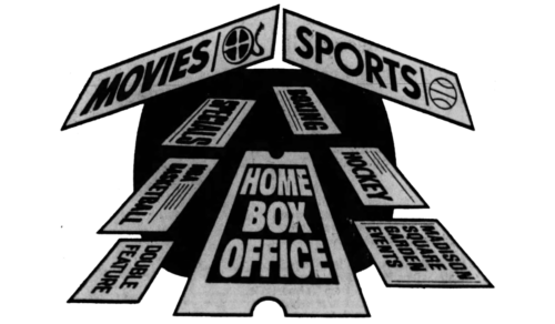
The very first logo, created for the Home Box Office, the company, which today is known as HBO, featured a composition with lots of elements, set in a monochromatic color palette. It was a solid black background with rounded angles, and several envelopes flying into it, with each envelope signed in a heavy Sans-serif font, and the central one featuring the “Home Box Office” lettering. The top part of the composition was decorated with two envelopes, form in ga triangular roof.
1973
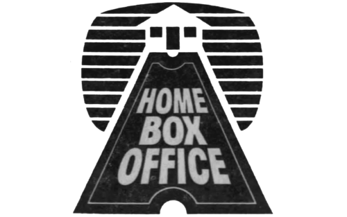
The redesign of 1973 slightly simplified the composition of the Home Box Office logo, removing the envelopes. The new badge, also set in a black-and-white color palette, featured a geometric image of a house, drawn in white on a black background with medium-thick white horizontal stripes. The road to the house was stylized as an elongated stylized ticket, where the name of the company was written in the uppercase of a geometric sans-serif font.
1973 – 1975
 The earliest HBO logo, which was used during its first five years of existence, was built around the full name of the company. The words “Home Box Office” were put inside a rectangular shape created by a stylized depiction of a lighted marque. Next to the word “Box”, there was a ticket stub.
1975 – 1980
 As soon as in 1975 a new version of the logo was developed by Bemis Balkind. It featured the abbreviation “HBO”, which emphasized that the network had already reached great popularity and did not need to use the full name to be identified. The letter “O” on the logo cut into the “B”.
1980 – Today
As the result of the 1980 modification, the “B” and the “O”were turned into full letterforms, although they were still attached to each other. The “O” preserved the original black circle inside.
Font
The HBO logo features a sans serif uppercase bold typeface looking like a highly customized version of the Avant Garde Gothic.
Color
Throughout almost a half-century of its history, HBO has never altered its black-and-white color palette.


