Fortune is an American business magazine, it was founded in 1929 by Henry Luce, it is now published by Fortune Media Group Holdings and owned by Thai businessman Chatchaval Jiaravanon. The magazine is most famous for the “Fortune 500”, which is a rating of the most powerful companies in the world, Fortune magazine is a highly-respected publication covering all aspects of business news.
Meaning and history
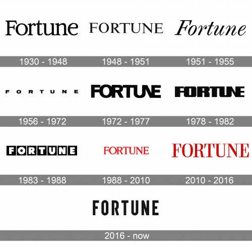
The Fortune logo first appeared at the top of inaugural issue in February 1930 and has been changed 10 times during the magazine’s history.
The current Fortune logo aims to revive Fortune’s modernist heritage and yet take it into a new direction. As a result the logo’s design is clean, modern, approachable, and clutter-free.
1930 – 1948

The very first logo for Fortune was written in a full-shaped elegant style with the title-case inscription in a medium-weight serif typeface. The black letters of the logotype were placed close enough to each other, but not glued, so the balance was there.
1948 – 1951

The redesign of 1948 switched the title case of the Fortune logo to the uppercase and refined its typeface. The new serif font looked sharper and more stylish, being a really good reflection of the magazine’s reputation and reliability, along with its willingness to stay one step forward and lead.
1951 – 1955
Despite the brilliant design of the previous logo, it was changed to a completely new one in 1951. The refreshed inscription was again set in the title case but this time executed in an italicized and slightly narrowed serif typeface, with enlarged serifs and a curved top part of the lowercase “R”.
1956 – 1972

The Fortune logo was changed again in 1956 and this time it was a modern sans-serif inscription with bold black letters flattened and placed on quite a big space from each other. The inscription looked powerful and modern, and this is why the version stayed with the magazine for almost 16 years.
1972 – 1977
The redesign of 1972 made the opposite thing — the flat and wide letters of the logotype grew, and the space between them disappeared, so now the full-shaped sans-serif inscription had all of its capital letters glued to each other.
1978 – 1982
In 1978 the typeface of the Fortune logotype was changed again. With the new experiment, the inscription got a bold and modern sans-serif with softened angles of the letters and massive stable shapes. It was a bold and confident logo, which evokes a sense of stability and professionalism, though looked slightly heavy.
1983 – 1988

The redesign of 1983 changed the style of the logo again. Now the inscription was set in white bold sans-serifs with every letter placed on a solid black square. It was a progressive and contemporary logo, though it did not reflect the essence of the editorial well enough. This is why another redesign followed pretty soon, in only five years.
1988 – 2010

The logo created for Fortune in 1988 was red. It was almost the same elegant sans-serif as the one from 1948, but with a new color and slightly refined shapes, it looked completely different. Also, the serifs got a bit longer, which added finesse and sophistication to the sense of power and passion, which were evokes by the new color of the logo.
2010 – 2016

In 2010 the typeface was changed again, but not dramatically. It was still a red uppercase serif lettering, just with the contours of the letters emboldened and a bit narrowed. The whole identity started looking more chic and fancy.
2016 – Today
The Fortune logo swiftly adapts to the times. At certain moments in its history, title radically reimagined how it presents its name to the world. The new Fortune logo recreates a modern sans serif that further emphasizes a bold and contemporary design.
A Fortune signature, it’s strong, long-form stories, is now paired with modern, graphic, forward-leaning look.


