One of the most well-known live-action superhero children’s television series created in the US, Mighty Morphin Power Rangers gave rise to the successful merchandise that has lasted since 1993.
Meaning and history
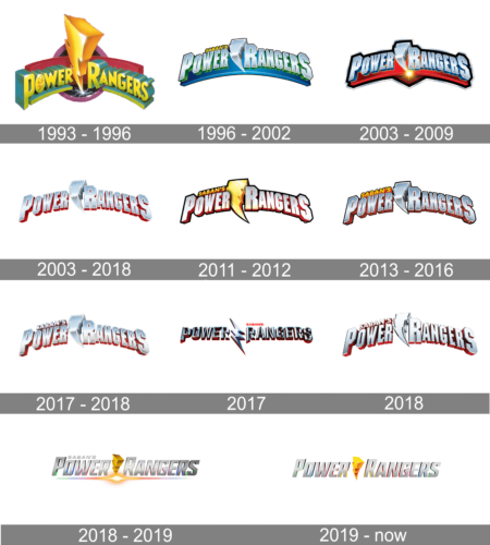
The Power Rangers visual identity was redesigned nine many times throughout its relatively short history, though almost all the logos were executed in the same style concept, and the main thing that changed during the years was its color palette.
1993 — 1996
The original emblem for the franchise featured a three-dimensional composition in a very rich yet tender color palette, consisting of fuchsia, yellow and gradient green. The logo was built around the arched underlined wordmark with an enlarged yellow lighting bolt placed in the middle, and dividing the “Power” from the “Rangers”.
1996 — 2002
In 1996 the typeface and the color palette of the logo were changed along with its disposition. Now it was executed in a cold blue palette with the lighting bolt more delicate than on the previous emblem, and the letters, on the contrary — more brutal and geometric.
2003 — 2009
The redesign of 2003 kept the composition of the Power Rangers’ visual identity untouched, though switched its color palette to a stronger and brighter one. Now the silver three-dimensional wordmark with the flash was placed above the intense red banner.
2003 — 2018
In 2003 the banner was removed and the logotype became the only part of the visual identity. It was executed in gradient silver and had its shadow colored red, which gave a strong contrast to the image.
2011 — 2012
The logotype gains a black outline in 2011. The lightning bolt is now colored yellow and becomes an eye-catching element of the whole emblem. It was a strong badge, which looked bright and confident in any background.
2013 — 2016
In 2013 the color palette of the main emblem gets simplified to silver and red again, with its geometric bold letters in a thin black outline. The only bright element on this logo version was the yellow “Saban’s” inscription, placed on the upper left part of the badge, right above the wordmark.
2017 — 2018
Even the “Saban’s” inscription was colored silver and red in 2017. The new emblem fully repeats all the previous versions, but looks cooler and fresher than any of them, due to the use of lighter shades of gray for the letters’ bodies.
2018
In 2018 more black accents were added to the Power Rangers logo, and it made the letters look narrower. The brand also starts using more intense gray shades for its metallic texture, and the emblem starts looking more professional and confident.
2017
In 2017 the brand used another version of the logo — it was lettering, set in a straight line, with its letters having their silver parts rounded, though the dark red outline and shadows made the edges straight and sharp. The lightning bolt on this logo was redrawn and stylized, looking more like a zig-zag.
2018 — 2019
The redesign of 2018 made the Power Rangers logo lighter, writing its wordmark in silver square letters, set in one lined and dividing the two parts of the inscription by a three-dimensional yellow lighting bolt, turned in ¾.
2019 — Today
Super Ninja Steel emblem
The season of the show released in 2018 remains consistent in terms of the logo’s visual core. However, there has certainly been a shift in the color scheme, as well as the typeface.
Font
The 2018 version of the wordmark includes three custom fonts. The type used for the words “Power Rangers” has characteristic parts of the letters “P”, “O”, “R”, and “S”: they look as if they were taken from a hexagon. The letters in the word “Super” look curvy, while the “Ninja Steel” type has sharp or straight angles.
Color
The Power Rangers logo featured a wide variety of color schemes throughout its more than 25-year history.


