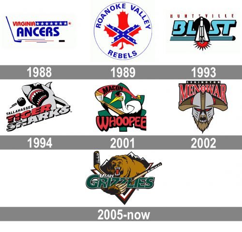
The franchise that today is called the Utah Grizzlies had seven different names and resided in five cities from 1988 to 2003. Then it was bought to replace the original Grizzlies ice hockey team in West Valley City, Utah.
Meaning and history
The Utah Grizzlies, a professional ice hockey team, were founded in 1995, emerging from the relocation of the Denver Grizzlies. Their establishment was a strategic move to bring high-level hockey to Utah. Since inception, the Grizzlies have become a notable force in the ECHL, showcasing their prowess in ice hockey. In their early years, the Grizzlies achieved remarkable success, which included winning the Turner Cup in the International Hockey League (IHL) during their first season (1995-1996). This victory marked them as a formidable team in the league and set a high standard for their future endeavors.
Over the years, the Utah Grizzlies have gone through various transitions, including league changes and affiliations with different NHL teams. These shifts have not deterred their competitive spirit or their ability to attract and nurture talent. In recent years, the Grizzlies have continued to make significant contributions to the ECHL, with players frequently advancing to higher levels, including the NHL. Their impact on the development of players is well-acknowledged within the hockey community. As of now, the Utah Grizzlies continue to uphold their reputation, participating actively in the ECHL and striving for excellence both on and off the ice. They remain a crucial part of the local sports landscape in Utah, drawing in fans and aspiring athletes alike.
What is Utah Grizzlies?
The Utah Grizzlies is a professional ice hockey team competing in the ECHL. Renowned for their rich history and notable achievements, including winning the Turner Cup, they continue to be a significant presence in professional hockey, contributing to the sport’s development and popularity.
1988 — 1989
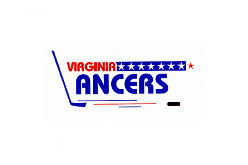
The Nashville South Stars club was renamed the Virginia Lancers in 1988, and this is when the logo was designed. It was a clean and simple blue and red emblem written on a white background. The red “Virginia” in small capitals of a bold sans-serif typeface was accompanied by a narrow yet long horizontally stretched blue banner with seven white five-pointed stars on it, and one red placed right after the banner. As for the “Lancers” part of the logo, it was written under, with the first letter replaced by a blue hockey stick. The wordmark was underlined by thin blue and red strokes and had a black hockey puck image after the “S”.
1989 — 1993
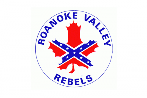
The club’s name was changed to Roanoke Valley Rebels in 1989, and the logo was redesigned as well. The new badge featured a circular blue outline and an uppercase sans-serif inscription written inside the badge around its perimeter. The center of the logo was taken by a solid red maple leaf image with an X-cows in blue, having eight white five-pointed stars on it.
1993 — 1994
For the Huntsville Blast name of the club, the logo was introduced in 1993. It was a light blue futuristic inscription in a custom sans-serif typeface with smooth contours and straight cuts of the letters, outlined in black. The logotype was underlined by a horizontally stretched element in the same shade of blue, with several thin black lines on it, and a black hockey puck on its right end. The white rocket was drawn vertically on a solid black circle in the center of the badge, accompanied by an r d stylized flash at the bottom. The “Huntsville” part of the wordmark was written above the badge in bright red color, executed in a narrowed custom sans-serif font with lots of space between the letters.
1994 — 2001
The club changed its name to Tallahassee Tiger Sharks in 1994, so the new badge had to be designed. It’s was a gray, black and red logo with an image of a shark, trying to catch a hockey puck. The “Tiger Sharks” wordmark was placed under the image in two lines, executed in an extra-bold outlined Ses-serif with the upper level in red, and the bottom one — in gray. The first two letters of each level featured a black horizontally striped pattern.
2001 — 2002
“Macon Whoopee” was the name of the hockey club for a few months in 2001. The logo for the new name featured a funny and colorful caricature of a white bird width black, red, and yellow details, placed on a solid green background and holding a brown hockey stick in its wings. The hockey stick was stylized as a flag, with a red banner waving from it to the right. The black sans-serif “Macon” inscription was written over it. As for the “Whoopee” part, it was set in red capitals of a smooth rounded sans-serif typeface with each letter outlined in black.
2002 — 2003
The name of the club was changed again in 2002, and this time it was “Lexington Men’O’War”. The logo of the new team featured a gray and brown image of a Viking with his eyes red and a two-level inscription arched above it. The lettering had its upper line straight, executed in a simple bold sans-serif in white, and placed on a clean black background. As for the “Men’O’War” Part, it was executed in red serif uppercase letters, outlined in white, with the letter “O” stylized as a target sign.
2005 — Today
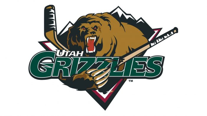
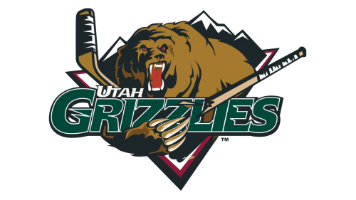
The logo of the new Grizzlies appeared in 2005. The team officials wanted it to represent the state of Utah, the players and their determination to win, something that would last for years.
The logo of the previous Grizzlies was in line with all those requirements. It was fierce, represented courage and character. So they used it having made some alterations to the color scheme.
A large brown and black grizzly bear with huge claws is roaring. Its fangs, red tongue and eyes are scary. Instead of playing hockey as it is often depicted in sports logos this bear has broken the hockey stick. Behind the bear there are black and white mountains. The beast is framed with a triangle which has black, white and red sides.
The team’s name is written in the foreground in a slightly slanted font. The word “Utah” is in white and the word “Grizzlies” is in deep green and outlined in white and black. It looks as if the bear is supporting it with its paw. There is evidently some meaning in it.


