The logos with the wordmark “Peoria Rivermen” are numerous as there have been several clubs named Peoria Rivermen. They belonged to different hockey leagues. The present Peoria Rivermen team is the fourth version.
Meaning and history
Being based in Peoria which is a river port in Illinois, the Southern Professional Hockey League’s franchise sticks to the water theme as far as its logo is concerned.
The wordmark “Peoria Rivermen” tilted at an angle featured the new custom font called “Rivermen”. The wordmark was set against the wheel, at the bottom of it.
1984 – 1996
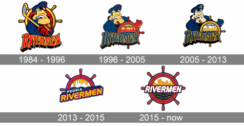
The first logo for Peoria Rivermen was created in 1984 and stayed with the club for a decade. It was a bright caricature of a sailor in a dark blue uniform, with a hockey puck in his teeth and a hockey stick in his hands. Behind the man, there was a yellow and red steering wheel image, and under — the wavy shadowed wordmark in a narrowed serif typeface.
1996 – 2005
The redesign of 1996 has slightly changed the composition of the club’s visual identity. The captain remained the main hero, though now he was balding the steering wheel, where the red city landscape and arched “Peoria” lettering were drawn. The black puck in the man’s teeth turned white, and the red inscription became sharper and changed its color palette to dark blue and yellow.
2005 – 2013
In 2005 the logo was redesigned again. This time it was all about the color palette, as all contours remained untouched. Red shades were removed from the emblem, and replaced by white and blue. This made the whole badge look calmer yet also stronger and more professional. The refreshed logo stayed with the club for almost eight years and was a very confident representation of the club’s character.
2013 – 2015
The first Peoria Rivermen logo of 2013 used the elements from the 31-year history of the Peoria franchise. The ship’s wheel was the same as in their predecessor’s logo of 1984-1985. Inside the circle there was the skyline of the city of Peoria, white on gold, and the Illinois River in navy blue and gold.
2015 – Today
Later the Peoria Rivermen logo underwent some minor changes. The designer reversed the colors of the city skyline and placed the wordmark across the middle of the wheel. Now the lettering includes only the word “Rivermen”. The logo keeps the team’s official colors ‒ red, navy blue, white and gold.


