 International Hockey League Logo PNG
The International Hockey League (IHL) is a professional ice hockey league that serves as a stage for showcasing talent in the sport. Unlike a singular ownership model, the IHL is collectively owned by its member teams, which lends a unique cooperative dimension to its management. Geographically, the league’s operations extend across various regions, predominantly in North America, where it has a significant presence. The IHL provides a platform for players to develop and display their skills, contributing to the larger ecosystem of hockey by nurturing talent and offering competitive play.
Meaning and history
The International Hockey League was established by a group of investors passionate about hockey, with its inception dating back to the mid-20th century. It was envisioned as a platform to foster hockey talent and provide entertainment for fans across North America. Throughout its history, the IHL has been instrumental in developing players who later shone in the National Hockey League (NHL) and other international arenas. Its main achievements include being a crucible for rising stars, hosting memorable seasons, and contributing significantly to the local economies where its teams are based. Currently, the IHL stands as a robust entity in the hockey world, known for its competitive spirit and its role in enriching the hockey landscape.
What is the International Hockey League?
It is a professional ice hockey league that operates mainly in North America. It is known for nurturing emerging talent and providing a competitive environment for teams and players, thus playing a significant role in the broader hockey community.
1945 – 1956
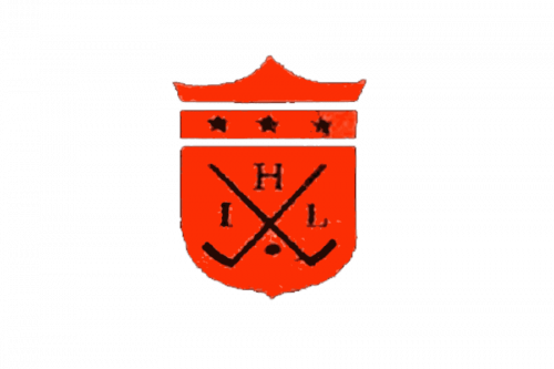
The original logo displayed a red shield with black imagery on it. That imagery consisted of two crossed hockey sticks and the letter ‘I’, ‘H’ & ‘L’ put inside various resulting sections. Only the bottom one was occupied by something else – a puck. There was also a thin rectangular plaque above the main shield, where three black stars were placed.
1957 – 1972

This logo was the same conceptually. The coloring switched to black and bronze. The red bits largely turned black, and the black ones became bronze. There was also a larger degree of volume in this emblem.
1972 – 1991
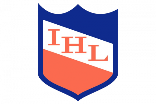
A much simpler design followed in 1972. This time, it was just a blue shield with two patches of white and red placed in its middle. Onto the white bit, they’ve placed the ‘IHL’ acronym. The letters were red serif characters.
1992 – 2001
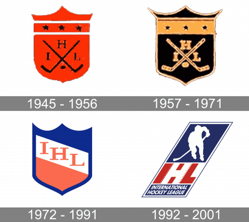
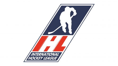
The International Hockey League logo is an embodiment of the dynamism of a hockey game. Here, you can see large red letters “I” and “L” with the white “H” created by the negative white space. The “I” and the “H” both have a “ragged” right side, due to which the illusion of motion is created. We should point out that the use of the negative space damages the legibility of the wordmark.
The IHL logo also comprises a figure of a hockey player in white inside a dark blue parallelepiped. Below, you can see the lettering “International Hockey League” in block capitals. Similar to the hockey player, the text is given in white against the dark blue background.


