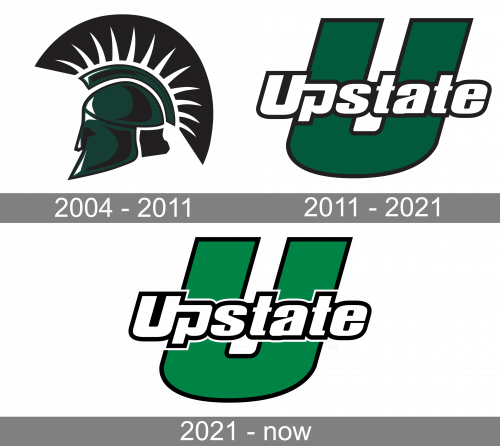
In spite of its seeming simplicity, the USC Upstate Spartans logo is recognizable and unique. The design is dominated by a large italicized “U” in green. At the forefront, the word “Upstate” can be seen. It has a modern feel, which can be partly explained by the unusual letter “p.”
Meaning and history
The inception of the USC Upstate Spartans traces back to the establishment phase of the University of South Carolina Upstate, dating back to the 1960s. This athletic division, named after the university’s mascot, Spartans, was established to participate in intercollegiate sports competitions. Through the decades, the Spartans have carved out a reputation for excellence in several sports disciplines, particularly shining in basketball and soccer. Their basketball teams, both men’s and women’s, have repeatedly demonstrated prowess in their conference, securing numerous victories and accolades. Similarly, the soccer teams have etched their mark, clinching conference titles and making commendable appearances in NCAA tournaments.
Presently, the USC Upstate Spartans stand as a symbol of athletic dedication and competitive spirit. Their journey from a nascent sports program to a recognized force in collegiate athletics mirrors the growth and evolution of the University of South Carolina Upstate itself. The program’s focus on nurturing athletic talent alongside academic growth continues to draw skilled student-athletes, contributing to the university’s expanding legacy.
What is USC Upstate Spartans?
USC Upstate Spartans represents the dynamic athletic wing of the University of South Carolina Upstate, competing in collegiate sports. Renowned for their achievements in basketball and soccer, they exemplify a blend of athletic excellence and academic integrity.
2004 – 2011

The USC Upstate Spartans visual identity, introduced in 2003, stayed unchanged for five years. It was a badge with only one graphical element — the Spartan helmet, placed in profile, and executed in the black and green color palette. The dark green shade of the logo looked sleek and evoked a sense of professionalism and reliability, while black details were adding strength and a sense of fighting spirit to the concept.
2011 – 2021

The previous two logotypes, which were introduced in 2003 and 2009, alluded to the Spartan theme. Both depicted the side view of a Spartan helmet decorated with the black-and-white hackle. The two logos looked almost identical, yet the older one had several black shades, which were removed from the newer logo.
2021 – Today
The logo presents a bold, capitalized typographic treatment that communicates strength and stability. The “U” is prominently stylized with a unique split design that forms a visual anchor for the logo, conveying a sense of establishment and robust foundation. The typeface used for “Upstate” is sans-serif, which gives the logo a modern and clean appearance. This is accentuated by the stark contrast between the vivid green filling of the characters and the thick black outline that adds definition. The black contouring not only emphasizes the lettering but also adds depth, making the text pop against any background. The green color is fresh and lively, which is associated with growth and vitality, qualities that resonate with the forward-thinking attitude of the entity the logo represents.
USC Upstate Spartans Colors
GREEN
PANTONE: PMS 349 C
HEX COLOR: #00703C;
RGB: (0, 112, 60)
CMYK: (100, 0, 91, 42)
BLACK
PANTONE: PMS BLACK 6 C
HEX COLOR: #000000;
RGB: (0,0,0)
CMYK: (0,0,0,100)
WHITE
PANTONE: P 1-1 C
HEX COLOR: #FFFFFF;
RGB: (255, 255, 255)
CMYK: (0, 0, 0, 0)”


