UAZ is the name of a Russian automaking brand, which was established in 1941 in Ulyanovsk, the city which the company was named after. UAZ is mainly known for its military 4WD cars, pickups, and off-road vehicles. The first models were created during World War II.
Meaning and history
UAZ is the car brand, which was established in very hard and full of tragic times of World War II, and the first vehicles of the company were meant to be used by soldiers of the Russian army. There was absolutely no time and mood to think of a logo for those first cars, so the first official badge for UAZ was introduced in 1950, nine years after the brand’s foundation.
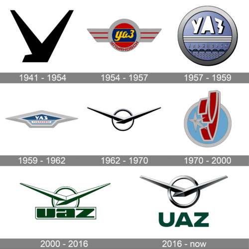
1941 – 1954
The very first badge for UAZ looked very delicate and modest. Placed on the grille of the brand’s cars, it was a simple metallic “tick”, resembling an abstract geometric bird, or a letter “V” with sharp ends of the lines. The bottom part of the symbol featured a flat and lightly widened line, which added stability and confidence to the overall look of the badge.
Depending on the model of the car, the badge could be enlarged, and then it took the whole height of the grille, looking sharp and even aggressive. In this case, the “V” resembled a true symbol of the “Victory”.
1954 – 1957
The redesign of 1954 introduced a completely different ambler — with the circular central part and two geometric and straight wings coming out of it to the sides can the new colorful badge looked friendly and dynamic.
The circular part of the UAZ logo featured an intense red background with a blue horizontal banner coming through its middle point. The “UAZ” wordmark in Russian was written over the blue banner in thick yellow cursive.
1957 – 1959
In 1957 – 1959 the brand was using three different badges for its cars. One was a light blue and silver circular badge in a thick frame and with two silver horizontal lines under the strict white wordmark.
1959 – 1962
The redesign of 1959 brought a new unified logo design to the brand, and it was a geometric badge with a triangular top, resembling an arrow, pointing up. The emblem was executed in sky-blue and featured an extra-thick silver outline, repeating the contours of the inner part. The silver wordmark was written in Russian inside the badge, looking confident yet fine.
1962 – 1970
The badge we all can see today was created for UAZ in 1962, basing the original version of the brand’s emblem, the “V”. But this time it was placed over a small circle in a thin frame and had its thick and sharp bars spread far to the sides, symbolizing freedom and speed. There was no lettering on this logo version, just a sleek contemporary sign, which looked powerful and stylish.
1970 – 2000
Along with a slightly refined emblem from 1962, the brand starts using another badge in 1970. It was a dark blue rectangle in a thin silver outline, with a stylized silver bird on it. The bird looked very similar to the iconic UAZ “V” but had the end of its wings softened and slightly bent, which added some tenderness and made the badge look friendly, and the brand — reliable and loyal.
2000 – 2016
In 2000 the brand starts using its “V” on a circle placed above a massive outlines inscription in Latin letters. The color palette was changed from gradient silver to military-green and gray, which made everyone remember the roots and the beginning of the brand. This emblem is still used on some of the UAZ models, and is the only one, with the company’s name written not in Russian.
2016 – Today
In 2016 the company brought back its emblem from 1962, refining its contours and adding more gloss to its three-dimensional metallic composition. This time the symbol was placed over a green wordmark in Russian, executed in a heavy sans-serif typeface, which looks brutal and stable.
Font and color
There are two different versions of the UAZ visual identity, used by the brand Today. The first one was designed in 2000 and featured extra-bold lines and square shapes of the sans-serif letters, with the softened angles. The typeface from this version looks very masculine and even brutal.
As for the second version, its logotype is executed in lighter and thinner lines, though it still doesn’t lack confidence and masculinity. The typeface of the UAZ logo designed in 2016 is very close to such famous fonts as Integral CF Demi Bold and Body Text Large Extra Bold, with clean thick lines.
The green and metallic color palette of the UAZ visual identity represents the strength and seriousness of the brand, elevating the look of the emblem and Addis a touch of professionalism and responsibility.


