

![]() Ram Logo PNG
Ram Logo PNG
The Dodge Ram stands as a formidable and iconic full-size pickup truck, renowned for its proprietary design and distinguished history of excellence. This versatile vehicle is celebrated for its unparalleled durability and ruggedness, which make it the perfect choice for both work and leisure activities.
With production facilities located in both the United States and Mexico, the Ram is a force to be reckoned with in the fiercely competitive world of automotive engineering. Despite its recent acquisition by Stellantis, the Dodge Ram continues to dominate the market with its exceptional quality and unmatched performance.
Meaning and history
![]()
Ram, the truck brand owned by Stellantis, originally emerged as a sub-label of Dodge and was referred to as Dodge Ram until it split off as an independent brand in 2009. These versatile and rugged trucks have become a popular choice for personal and commercial use, recognized for their comfortability and toughness.
Ram’s origins trace back to the Dodge Brothers Company, launched at the beginning of the 20th century by Horace and John Dodge. The firm began manufacturing trucks early on, but it wasn’t until 1981 that the Ram name was brought into the public for Dodge’s full-size pickups. Ram Trucks was eventually created as an independent unit of the Chrysler Group LLC in 2009, to develop and market its brand of trucks.
Today, Ram is widely recognized for constructing a spectrum of trucks with impressive towing and hauling capacities, the latest technology, and robust motors. The brand’s lineup includes the famous Ram 1500, Ram 2500, and Ram 3500 models. These vehicles have accumulated fame for reliability, durability, and top-notch performance, making them a top choice for anyone seeking a capable and dependable truck.
Despite the ever-changing trends and features of light cars, its badge has remained relatively consistent throughout the years. However, the same cannot be said for the individuality of the organization itself, which has undergone numerous transformations and expansions throughout its history. This can be observed through the various iterations of the logo that have emerged since the establishment of the auto business by the innovative brothers, John F. Dodge and Horace E. Dodge.
What is Ram?
The Dodge Ram is a legendary full-size pickup truck renowned for its unique and recognizable design and a long chronology of superior performance. Its robustness and durability have transformed it into a popular choice for professional and recreational use, with manufacturing plants situated in the US and Mexico.
Despite its acquisition by Stellantis, the Dodge Ram remains at the forefront of the fiercely competitive machine-building industry, establishing the standard for others to follow.
1914 – 1969
![]()
The Dodge Trucks logo is a striking display of a minimalist layout. The typography represents lettering in a thick, square font that demands attention. Each character is uniquely crafted, from the tiny serifs of the “D” to the quadrangular shapes of the “O” and “G.”
The extended facedown line in the “E” gives the symbol a distinct appearance, resembling a pitchfork inclined to the right. The “U” and “C” are mirror pictures of each other, forming wide staples that hold the word caption together. The jet-black text caption on a white backdrop creates a stark contrast that draws the eye in and leaves a lasting impression.
1969 – 1993
![]()
The 1993 logo is a tripartite masterpiece, with a pentagonal star above in a slim white rectangle, the thick, outstretched lettering of “Dodge Trucks” in jet below, and the abbreviated “Dodge” in white on a black background sandwiched between them. The uppercased serif typeface is stenciled to perfection, while the wording is a blend of title case and lowercase characters. The white rectangle appears to be the divider between the black, giving it an eye-catching appeal.
1993 – 2009
![]()
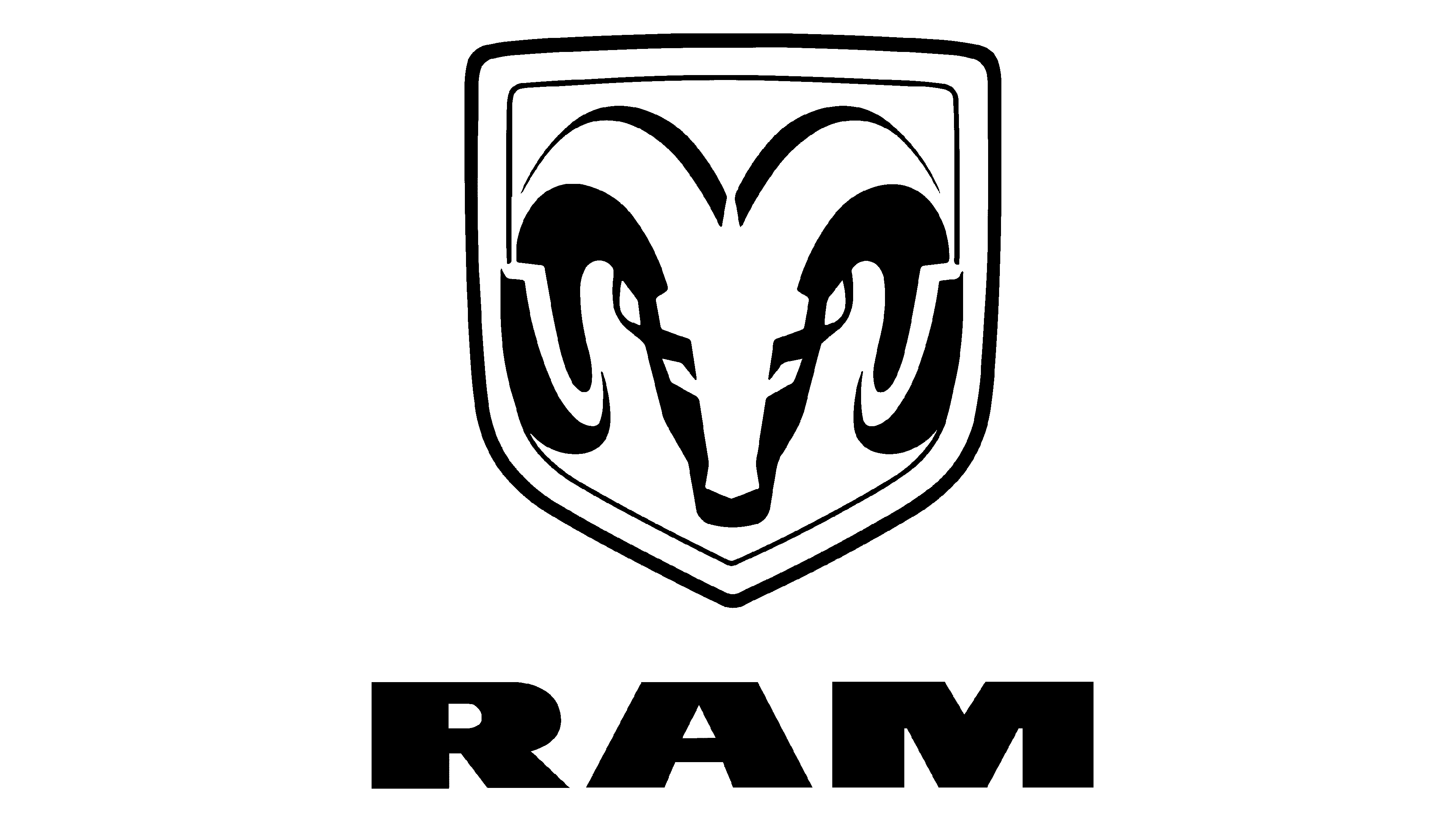
During the second and third generations, Dodge Ram Trucks endured a significant transformation, which included the renaming of Dodge Ram and the adoption of a new logo. The ram’s head emblem on the hood was the inspiration for the brand identity, with the creature’s dual image emerging from the white and red space. It stands aggressively on the flank, pointing towards the front with its sprawling antlers, and the word “Ram” appears in stately letters at the base.
2009 – 2023
![]()
The reinvention of the Ram Trucks logo maintained the wording manner while entirely transforming the visual. The Ram’s head and shield remained, but their appearance changed drastically. The 3D head of the Ram now dominates the hood, with a gradient from bright gray to lead making a stunning result.
The shadows and highlights are masterfully combined to produce a 3D image that is structurally arranged rather than randomly scattered, giving it a mirror-like effect. The metallic shield is volumetrically framed and entirely filled with the head and horns, creating an alluring appeal.
2023 – now
![]()
The new 2023 logo is a more stylistic depiction of their name. It’s essentially just these three letters, all capitalized and written in a new font. That new font uses characters that are stretched sideways to appear overly wide and stunted. Moreover, their appearance isn’t ordinary. The characters are simplistic, both ‘R’ and ‘A’ lack their usual central bars, and there are also unusual chipped sections on the inside.
The general style is quite angular and geometric. In its core, it’s a regular sans-serif with strictly straight lines.
Color
The strikingly sophisticated color scheme of the Ram Trucks logo blends black and white seamlessly, with a bold addition of red in the 1993 iteration. As the business developed and progressed, the elaboration of its symbol kept pace with its growth, always keeping the Ram in the spotlight. Yet it stayed true to the label’s values and mission, which is reflected in the consistent color code.
Font

The contemporary badge of the carmaker showcases the Optiflare typeface, which comprises short and broad characters devoid of serifs.


