

![]() Atari Logo PNG
Atari Logo PNG
The history of Atari has its roots in the small engineering company Syzygy Engineering created by Nolan Bushnell and Ted Dabney in 1971. The following year, Arari, Inc. was founded and Al Alcorn, their first design engineer, started working on an arcade variation of one of Magnavox Odyssey’s games. This game, which was later called Pong, played an important role in the Atari logo history.
Meaning and history
![]()
The Atari visual identity hasn’t changed much since the date of the company’s establishment and its initial logo introduction. Its elegant yet progressive symbol, used on the very first logo version, is still used by the brand and brilliantly represents its essence and values.
1970 – 1972
![]()
It all started with Syzygy, which is the name of the company that is featured in this logo. It is printed using a relatively simple font with diagonal cuts and no serifs. The custom “S” that span across the top of the whole inscription added a unique touch to the logo. The is also a tagline that specifies what the company is focused on, specifically “Entertainment Electronics Development”. The logo is decorated by a grid with four black and one white circles arranged into a pattern. It is a well-designed logo that looks great even half a century later.
1972 – 1973
![]()
The new company name was done using a Busorama Bold font, modifying it only by mirroring the second “A”. The curved strokes added a touch of sophistication and intrigue. The “Atari” portion was the name printed using larger characters, while “Inc.” was done using a smaller font. The logo was done in black on a white background, giving it a classic and timeless look.
1973 April – June
![]()
A very unexpected and abstract logo was presented during the year 1973. It consisted of a horizontal oval shape with an asymmetrical line going through it horizontally in the background. An ambiguous shape with sharp ends and corners resembled an “A” or the first letter of the brand’s name.
1973 June – July
![]()
The previous logo was reworked by adding the company name to the right of it. It was printed using a very interesting, sans-serif typeface. The most interesting were the “A” and “R” characters that had long curved leg. The “A” also featured a slanted horizontal line, which enhanced the unique character of the logo.
1973 July
![]()
For a very short period of time, the company used its name from the previous logo without the abstract symbol on the left. It was surely looking for a visual identity that would be a perfect representation of the brand.
1973 July – August
![]()
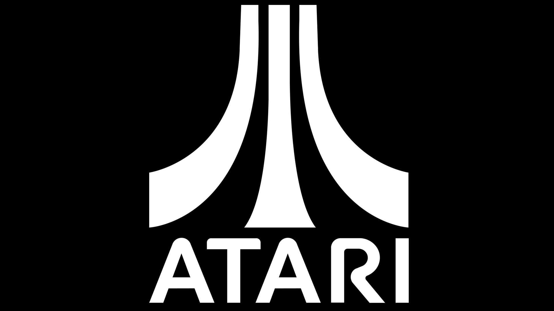
The original logo for Atari was created in 1972 and is still a part of the official visual identity policy of the company. The monochrome logotype in all capitals was placed on the right from a unique smooth emblem, which was sometimes set above the wordmark. The Atari emblem is a stylized letter “A”, composed of three bold lines, resembling a tower or a road. It stands for progress, movements, and individuality, while the soft lines of the inscription add tenderness and style to the whole image.
1973 – 2002
![]()
This logo does not look much different from the previous version. In fact, the designers simply chose a very similar font only with more rounded strokes. It closely resembles SF Atarian System. The symbol on the left was kept unchanged.
2002 – 2003
![]()
The color palette of the logo was changed in 2002, and went from monochrome to red and white, with the primary variant composed of a horizontally stretched red rectangle and white lettering with the second “A” replaced by the Atari iconic emblem. The secondary version of the visual identity boasted red symbols on a white background without any framing. The typeface of the new logo was a bit refined, with the letters shorter and wider than on the original emblem.
2003 – 2009
![]()
With the redesign of 2003 the red color of the Atari visual identity was elevated and brightened up, also the contours of all the elements were refined and the emblem was modernized, gaining more elegant lines, thinning to the top.
2009 – 2012
![]()
The company redesigned a logo it created back in 1973. The three-line symbol was enlarged and placed above the name, looking like an umbrella above it. Along with the name, it was done in white and placed on a red background to continue the new red logo trend. At the very bottom, they also added the company’s website address using a simple, small, red font.
2012 – Today
![]()
In 2012, the company brought back the logo it created back in 1973 and used it along with a red version.
2012 – Today
![]()
In 2010 the company comes back to its original logo design, executing it in their new official red and white palette. All the contours and lines were the same as on the badge from 1972, and its monochrome version is still used for printed material and official documents of the brand.
Symbol
At last, the era of the famous “Fuji logo” started. It made its debut in the arcade game Space Race in 1973. The emblem was crafted by George Opperman, who worked at his own agency Opperman-Harrington. The team also included representatives of Atari, George Faraco and Nolan Bushnell. They were responsible for the general instructions and selected the final version.
Emblem controversy

So, what does the logo mean?
The company doesn’t offer a single official explanation. The author of the logo, Opperman, told his own version of the story, while Faraco insisted that it was nothing but fiction.
According to Opperman, his main intention was to create something that would look like an “A” yet have a distinctive style. At that point, he took a closer look at the company’s most popular product at the time, the PONG game. Its basic structure could be described in the following way: a center line and something that hit it again and again from the right and the left. So, he designed a logo that looked like a scheme of this process.
In other interviews, Opperman also suggested additional versions of the story. For instance, he mentioned that he was trying to make something that would look like a Japanese character or depict mount Fuji.
Atari’s art director, George Faraco, however, denied that the story was true. “That’s somebody’s inventions, – he said about what Opperman told, – It’s just a design.” He claimed that Opperman just offered him several sketches and he picked one of them.
We should point out, though, that Faraco’s words don’t necessarily contradict Opperman’s story. In fact, it is very likely that the artist didn’t tell his clients what inspired his designs. There could be a lot of reasons for this fact. So, Faraco just picked a sketch without knowing the real meaning and inspirations behind him.
Font

The letters look very much like the typeface called SF Atarian System by ShyFoundry.
Color
![]()
The color scheme of the Atari logo is made up of only two colors: red and white.


