Tums is a brand of drugs, helping to deal with digestion problems, it is composed of sucrose and calcium carbonate. The medicine is produced by GSK, which is one of the most influential pharmaceutical corporations in the world.
Meaning and history
TUMS is an American brand of chewable heartburn tablets that have been on the market for almost a year and is the world leader in its segment.
TUMS chewable antacid tablets contain the active ingredient calcium carbonate, which is a natural source to quickly and effectively combat heartburn and relieve sour stomach, acid stomach upset and stomach upset associated with these symptoms. TUMS heartburn medicine neutralizes acid on contact, providing fast relief from heartburn.
What are Tums?
Tums is a brand of chewable tablets, one of the few combined antacid drugs that are approved for use not only in patients with GI disease but also for pregnant women. As part of Tums, there are two active components – calcium carbonate and magnesium carbonate. Thanks to the unique balanced formula, any side effects are completely minimized, and the positive effect of taking just one tablet is at an extremely high level.
1928 – 1980
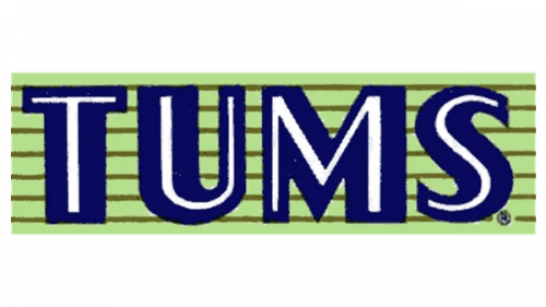
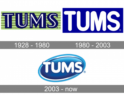
Originally, the logo was a collection of blue capital letters. They weren’t uniformly shaped, and there were also thin white cores inside each of them, which mimicked the look of the letters. The wordmark was them put onto a green, brown-striped rectangle for background.
1980 – 2003
The 1980 logo is a simple wordmark of the brand written in big white letters over a dark blue rectangle. The font is exactly as the one they continued to use in their next emblem evolution.
2003 – Today
Tums boasts a bright and modern visual identity, which is instantly recognizable across the world.
The wordmark, placed on a diagonally located oval, features all capital lettering is a bold rounded sans-serif typeface. The lines are smooth and thick, looking great in white on a blue background.
The oval of the Tums emblem is three-dimensional, which resembles a pill. The gradient and glossy blue looks contemporary and evokes a sense of stability and loyalty.
The blue and white color palette of the tums logo represents a reliable and trustworthy brand, which is capable to help people delicately and efficiently.
The badge is modern and bright and looks good on the packaging, making the brand’s products stand out on the shelve. The oval shape of the emblem symbolizes balance, unity, and friendship, creating a kind feeling.
Font and Color
The bold uppercase lettering from the primary TUMS logo is set in a rounded sans-serif typeface which looks very friendly and smooth. The closest fonts to the one, used in this insignia, are, probably, VAG Rounded Next Black, or Promo Semi Bold, with some modifications of the contours of the “M”.
As for the color palette of the TUMS visual identity, it is based on gradient shades of blue and white, a combination, which not only looks fresh and bright but also represents such qualities as reliability, professionalism, and excellence.


