 BD (Becton, Dickinson and Company) Logo PNG
BD is a US-based medical technology company. It produces and markets a wide range of medical devices, instrument systems, and reagents. In some areas of the world, the company also offers consulting and analytics services. It was established in 1897. The headquarters are located in Franklin Lakes, New Jersey.
Meaning and history
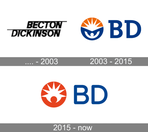
Like many modern logotypes, the BD logo can be broken down into two parts, the emblem and the wordmark. This structure remained unchanged over the first couple of decades of this century, as did the overall style and the core visual metaphor. However, the design has gone through updates over time resulting in a more professional and minimalist look.
Before 2003
The logo used until 2003 does not look anything like the BD brand image many are used to. First of all, it is black on typically a white background. The company initially used a full name and printed it in two lines using a cursive, sans-serif typeface. The lines were aligned to the right, which already added an unusual touch. The designers went one step more and “underlined” both words by adding a line on top of each and making it extend slightly further than the inscription. This was not a logo you would use as an example of an exceptional brand image, but there surely was something unique and simple about it.
2003 – 2018
The main part of the meaning is arguably carried by the emblem. If this image could speak, it would say: “We come to the rescue when one’s life is in danger” or “We can save your life”. This dramatic message is conveyed through a depiction of a human in the ocean and the rising sun.
The human figure is highly stylized. In actuality, there is only a circle for the head and half a ring for the upper part of the torso. The half the ring, however, works wonders as we immediately perceive it as extending hands. This is a universally recognized gesture that can be interpreted either as a gesture of worship or a plea for help. In the case of BD, the plea for help seems more natural.
You can imagine a shipwreck survivor who has spent hours in the ocean, the latter being symbolized by the blue color on the emblem. Eventually, the survivor sees something on the horizon, which gives him or her a gleam of hope. And the person spreads his or her arms to attract the attention of the potential saviors, to be noticed.
What is BD
Becton, Dickinson and Company is a global medical technology brand that claims its mission is to advance the world of health. In particular, the company makes and sells products needed for medical research, diagnostics, and the delivery of care and also offers related services.
In real life, the object that gives hope would probably be a kind of vessel, possibly a motorboat. In the case of the BD logo, though, the designers who worked on the project decided to take a more abstract approach. They placed the sun in the upper half of the emblem. Similar to the human figure, it is highly stylized – just a half of a star with multiple points. The sun is white, while the sky behind it is orange. This symbolizes sunrise, which is another universal symbol of hope.
The letters “B” and “D” placed to the right are of the same color as the “ocean” and have a classic shape. This provides legibility. What makes the letters unique is the unusual serif in the top left-hand part. Also, this serif makes the “B” and “D” “rhyme” as both the letters have it.
2018 – present
When the Becton, Dickinson and Company logo went through an update in the 2010s, this resulted in a sleeker logo. On the downside, the core metaphor is harder to grasp now.
The blue “ocean” disappeared from the emblem. Instead, there is only the human figure and the sun. The human figure is orange, while the sun is white and has fewer but larger rays. The problem is that now as the human figure has been moved lower, it is harder to see what it is. This makes it almost impossible to understand the meaning of the whole design.
Colors and font
Although the company has been loyal to the combination of dark blue and orange, there has been some playing around with the shades.
The type on the BD logo is simple, with rounded angles. While it provides adequate legibility, it is hardly unique. On the other hand, there is no need to make it unique here as the emblem looks recognizable enough.


