CVS Pharmacy is a subsidiary brand of CVS Health, the American health care company. It was founded in 1963 in Massachusetts and originally named the Consumer Value Store. The company has 7,700 retail pharmacies, more than 900 walk-in medical clinics, 65 million pharmacy benefit manager plan members, and expanding specialty pharmacy services.
Meaning and history
CVS Pharmacy is a brand, owned by CVS Caremark Corporation, one of America’s largest retailers of drugs and consumer products. CVS Caremark owns approximately 7 thousand pharmacies in most states of the country.
CVS Pharmacy was for a long time a subsidiary of Melville Corporation. In those years it was called Consumer Value Stores. Melville later changed its name to CVS Corporation after selling all non-core assets. CVS Pharmacy was officially founded in 1996
What is CVS Pharmacy?
CVS Pharmacy is the largest chain of pharmacies in the United States, which was established in 1996 by CVS Caremark Corporation. Today the chain has around seven thousand locations across the country, covering almost all the states of the USA.
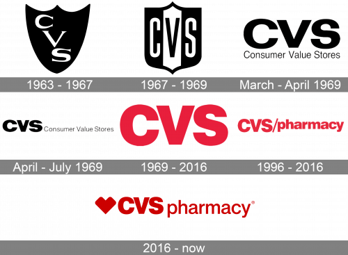
1963 – 1967

The original emblem was a black shield with three pointed tips in the top and the company’s acronym written diagonally across. That consisted of a trio of white letters – ‘CVS’ – with square proportions and a serif style.
1967 – 1969

The idea persisted, although they did change the design itself in the 1969. The shield turned into a more rectangular variation with a white stripe running vertically through its middle. The letters were now much more even and had a new sans-serif look. The middle one was also black to stand out from its white background.
March 1969 – April 1969

After that, the shield design was scrapped in favor of a bland acronym with its translation beneath. The letters were all black now and had more reasonable proportions than before. The usual ‘CVS’ was followed underneath by the ‘Consumer Value Stores’ writing in not as bold letters of the same style.
April 1969 – July 1969

For a few following months, they decided to move the full name to the right of the acronym. Other than that, nothing changed.
1969 – 2016

It’s more or less the same acronym as the one used since 1969, except without the translation and with the bright red coloring instead of the black one.
1996 – 2016

They didn’t give up trying to make it more comprehensive, though. In 1996, they introduced a secondary logo, which added the red word ‘pharmacy’ in the same font as the acronym, except fully in lowercase. The two parts were separated by a slash sign (‘/’)
2016 – Today
The CVS logo represents the brand’s role in shaping the future of health care for people, businesses and communities.
Bold, sophisticated and universal, the iconic CVS Health Heart is directly inspired by the organization’s purpose, and understood across ages, geographies and experiences. Its core geometry was created using teardrop shapes that were prevalent in the existing design system.
The CVS Health Heart logo is a flexible graphic element, acting as a pointer or bracket to emphasize important information.
The logo color palette is based on red and white, a perfect combination, giving a warm and energetic feeling.


