Vicks is a brand of cough medicines, such as drops, balms, and inhalators, manufactured by Procter&Gamble since 1985. The brand was created in 1890 and was owned by one family until the acquisition of 2005.
Meaning and history
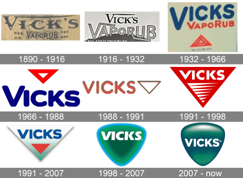
The Vicks’s visual identity design history is pretty rich. Created in 1890, the brand has undergone nine major logo redesigns and the last one was in 2007.
1890 – 1916
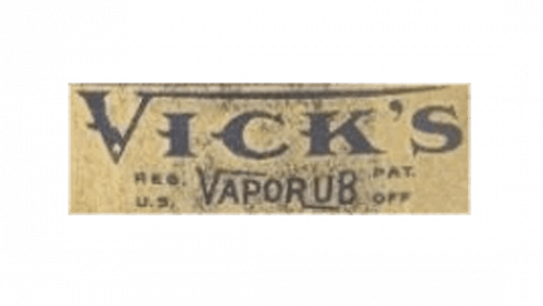
The original logo was a wordmark of words ‘Vick’s’ and ‘Vaporub’ one beneath the other. The ‘V’ in the first one had a long line protruding from its top that stretched all the way to the last letter. The second word had the letter ‘V’ with the same shtick, but the line there is shorter. And there’s also an ‘R’ with a similar, bottom extension.
The ‘Vick’s’ is positioned above and is generally much bigger than the ‘Vaporub’ part. They also use different fonts: the former employs an old Gothic style, while the latter has a generic sans-serif typeface.
1916 – 1932
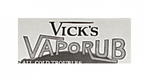
The first two Vicks logo versions featured a sharp geometric typeface with the long horizontal line coming out of the right bar of “V”. This signature letter stayed with the brand for over 40 years.
1932 – 1966
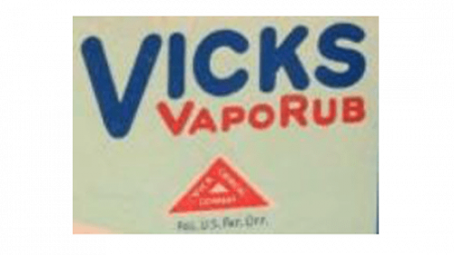
In the 1930s the brand decided to change its wordmark’s style to a more modern and bold. And now the all capitals nameplate gained thick smooth letters. That was also in the 1930s when the brand started using a triangle as a part of its visual identity design.
1966 – 1988
The 1966 emblem has the same ‘Vicks’ writing as the design before it. This one, however, doesn’t have an additional ‘Vaporub’ part. The letters here are also slightly wider and darker in terms of color shade. The triangle, for its part, moved to the space above the wordmark and was turned upside down.
1988 – 1991
For the 1988 logo, they made all the letters in the wordmark the same size, made the triangle much slimmer and then positioned the latter after the former. The colors for each also changed to a pale red.
1991 – 1998
The 1991 emblem is a big red triangle. It’s not hollow this time, although there are several long triangles of various sizes, all colored white. In the top portion, they put a wordmark. It’s similar to how it was before, except this one is white, and the letters are wider, bolder and less round.
1991 – 2007 (Europe)
A similar design was used for Europe in this time period. The triangle is wider and shorter. Color-wise, it was a gradient of white and blue (in the bottom). The lower half held a smaller red triangle, while the top section had a wordmark very similar to the one used in the previous logo, but blue and slightly changed.
1998 – 2007
In the 1990s the triangle, pointing down, became the logo’s background and went through a few modifications, until it wasn’t completely refined in 2007.
2007 – Today
The Vicks three-dimensional green emblem is a softened and rounded triangle with arched sides. The gradient green of the background looks sleek and glossy, while the thick white lettering in the sans-serif typeface adds professionalism and a sense of loyalty to the brand.
The Vicks logo is strong, modern and instantly recognizable. It looks really stylish and sleek due to the color texture and a refined shape.


