The ice hockey club Tucson Roadrunners was founded on the basis of the Springfield Falcons franchise, which relocated to Tucson before the 2016/17 season. The team is the AHL affiliate of the NHL’s Arizona Coyotes.
Meaning and history
The Tucson Roadrunners, an American professional ice hockey team based in Tucson, Arizona, were founded in 2016. The team was established when the Springfield Falcons franchise was purchased by the Arizona Coyotes and subsequently relocated. As an affiliate of the Arizona Coyotes of the National Hockey League (NHL), the Roadrunners play in the American Hockey League (AHL).
Throughout their history, the Tucson Roadrunners have achieved significant milestones. In their inaugural 2016-2017 season, they finished fourth in the Pacific Division, showing promise as a competitive team. The 2019-2020 season marked a high point for the Roadrunners, as they won the John D. Chick Trophy for topping the Pacific Division. This achievement showcased the team’s growing prowess and potential in the league.
Currently, the Tucson Roadrunners continue to compete in the AHL, striving for excellence and aiming to cultivate talent that can progress to the NHL. Their focus on player development has made them an integral part of the Arizona Coyotes’ organization, contributing to the broader hockey community in Arizona. The team’s ongoing efforts reflect its dedication to maintaining a strong presence in the AHL and fostering the growth of hockey in the region.
What is Tucson Roadrunners?
The Tucson Roadrunners are a professional ice hockey team competing in the American Hockey League (AHL). As an affiliate of the NHL’s Arizona Coyotes, they play a crucial role in developing talent for the major league. The team’s establishment in 2016 marked the expansion of professional hockey in Arizona, contributing significantly to the sport’s regional growth.
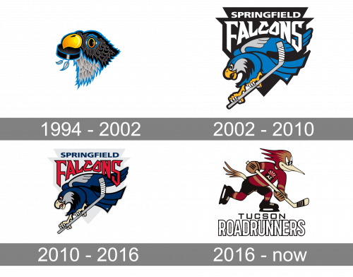
1994 – 2002
The very first logo of the hockey team was created in 1994 and stayed untouched for eight years, which is a long period. It was a very kind and precisely drawn image of a black and gray bird, holding a black hockey puck in its beak. The bird was turned to the left, had its beak executed in gradient yellow and orange, and boasted a thick blue outline, which added a good contrast between the badge and the background.
2002 – 2010
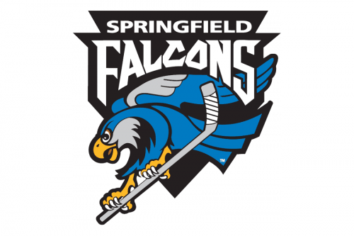
The redesign of 2002 kept the original blu, gray and black color palette, but has completely changed the style of the insignia: the new logo was composed of a fancy and sharp black crest, with the bold white lettering written over its upper part, and a smooth modern image of the bird in blue, placed under the wordmark. The hockey puck was gone from the badge, but now the bird was holding a light gray hockey stick.
2010 – 2016
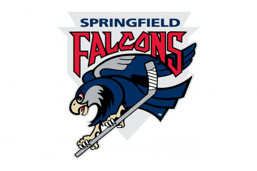
The contours of the composition remained untouched, but the color palette of the badge has undergone a complete refreshment in 2010. The background crest was now drawn in light gray, white the lettering turned red (for the “Falcons”) and blue (for the “Springfield”). As for the main hero, the falcon bird, it was drawn in a darker shade of blue and got some light beige, gray and red detail in addition to its thick black outline. The only element that didn’t get its colors changed was the hockey stick.
2016 – Today
The anthropomorphized bird depicted on the Tucson Roadrunners logo is wearing skates and holding a hockey stick. It seems to be moving forward with a very determined look on its face.
Colors
The palette has been apparently inspired by the Arizona Coyotes logo, which, in its turn, pays homage to Arizona landscapes. In their emblem, the Roadrunners use brick red, desert sand, copper, black, and white.


