Neither the name nor the logo of the American company TRW gives a clear indication of the type of product the brand specializes in. And yet, on a metaphoric level, you can perceive that the design creates a dynamic and innovative feel, it looks stylish without being overloaded with details. All these features are beneficial for the brand identity of a company known as a supplier of automotive systems, modules, and components to automotive original equipment manufacturers and related aftermarkets.
Meaning and history
1958 – 1965
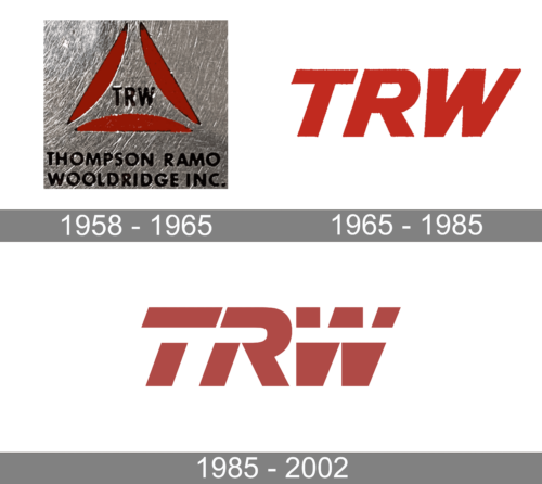
The very first TRW logo was created in 1958 and stayed with the company for seven years. It was a black uppercase inscription enclosed between three red “petals”, forming a triangle. The emblem was underlined by a two-leveled capitalized “Thompson Ramo Wooldridge Inc” lettering in a modern geometric sans-serif font, with wider contours of the characters, than in the “TRW” inscription.
1965 – 1985
The redesign of 1965 has brought a minimalistic yet powerful concept to the TRE badge. The new logo featuredbold red “TRW” lettering in a slanted sans-serif font, with the heavy characters set against a white background. The inclination of the characters, clean contours, and straight cuts of the lines, along with the intense red color, created a very strong and energetic image, which represented the company as a progressive and serious one.
1985 – 2002
The TRW logo comprises only the letters “TRW” without any pictorial emblem. How did the design forces behind the brand manage to create a unique and meaningful logo in such circumstances?
To begin with, they opted for a dynamic structure. In addition to the italicized font, a well-known way to add some motion, they used gaps in the glyphs, which only reinforce the impression. In spite of the gaps and the italicized type, the sans serif letters look pretty heavy and robust, symbolizing the reliability, power, and durability of the products.
Colors
The designers behind the TRW logo opted for a combination of white and bright red, which looks eye-catching and attractive. Quite a few researchers have found that red generally is associated with a positive emotional effect.


