Taking into consideration that Cummins was established as far back as 1919, it is only natural that its logotype has not stayed the same throughout the company’s almost 100-year history.
Meaning and history
The previous version depicted a solid letter “C”, which actually resembled a horseshoe. The “C” was positioned inside a square shape. Over the white space of the letter, the name of the company was written in smaller letters.
What is Cummins?
Cummins is the name of an American manufacturer of engines and power generation products, along with fuel, filtration, and emission control systems, established in Indiana in 1919, and named after its founder, Clessie Lyle Cummins. Today the company operates worldwide and has a very strong reputation.
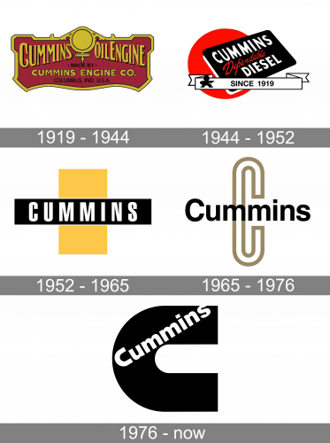
1919 – 1944
The original design was pretty cluttered, although, for its era, it looked natural. The emblem featured the words “Cummins Oil Engine.” Between the words, you could see a sign looking like the Venus (or female) symbol (a cross with a circle). The lettering was yellow. It was placed inside a complicated dark red shape inspired by the way a car looks from the front.
1944 – 1952
The so-called red ball logo featured the lettering “Cummins Diesel” (in white) and “Dependable” (red) on a black-and-white board. At the forefront, there was a banner housing a stylized human figure and the lettering “since 1919.” The large red circle was positioned behind.
1952 – 1965
This one was by far simpler. There was a black rectangle housing the word “Cummins” in white. It featured a minimalist all-caps sans looking very much like the one from the previous wordmark.
In the background, you could see a yellow rectangle standing on its narrow end.
1965 – 1976
The logo, used by the Cummins company in the 1960s — 1970s featured a completely different composition. This was the title case sans-serif lettering in a traditional full-shaped font, with the black characters set against a transparent background with an enlarged contoured letter “C” in dark gold. The lines of the graphical “C” coincided with the vertical bars of the first “M” in the logotype, which created an interesting and balanced look.
1976 – Today
The blue was replaced by black. The familiar design of the Cummins logo developed by Paul Rand stayed the same.
Font
The typeface featured on the Cummins wordmark appears to be Helvetica Neue 95 Black. It is a customized version, where the letter “C” has a unique shape.
Color
The three basic colors of the Cummins logo are red, black, and white.


