

![]() Bombardier Logo PNG
Bombardier Logo PNG
The Bombardier logo features the name of the brand in black over the white background. The letters belong to a rather bold and heavy sans serif type with traditional proportions. The basic shape is a rectangle.
Meaning and history
![]()
Bombardier Inc. is a Canadian multinational company mainly specializing in air and railway vehicles. It was established in 1942. It has an aircraft division, Bombardier Aviation, and a railway equipment division Bombardier Transportation.
Before 2003, Bombardier Recreational Products, a manufacturer of snowcats and snowmobiles, was part of Bombardier Inc., too.
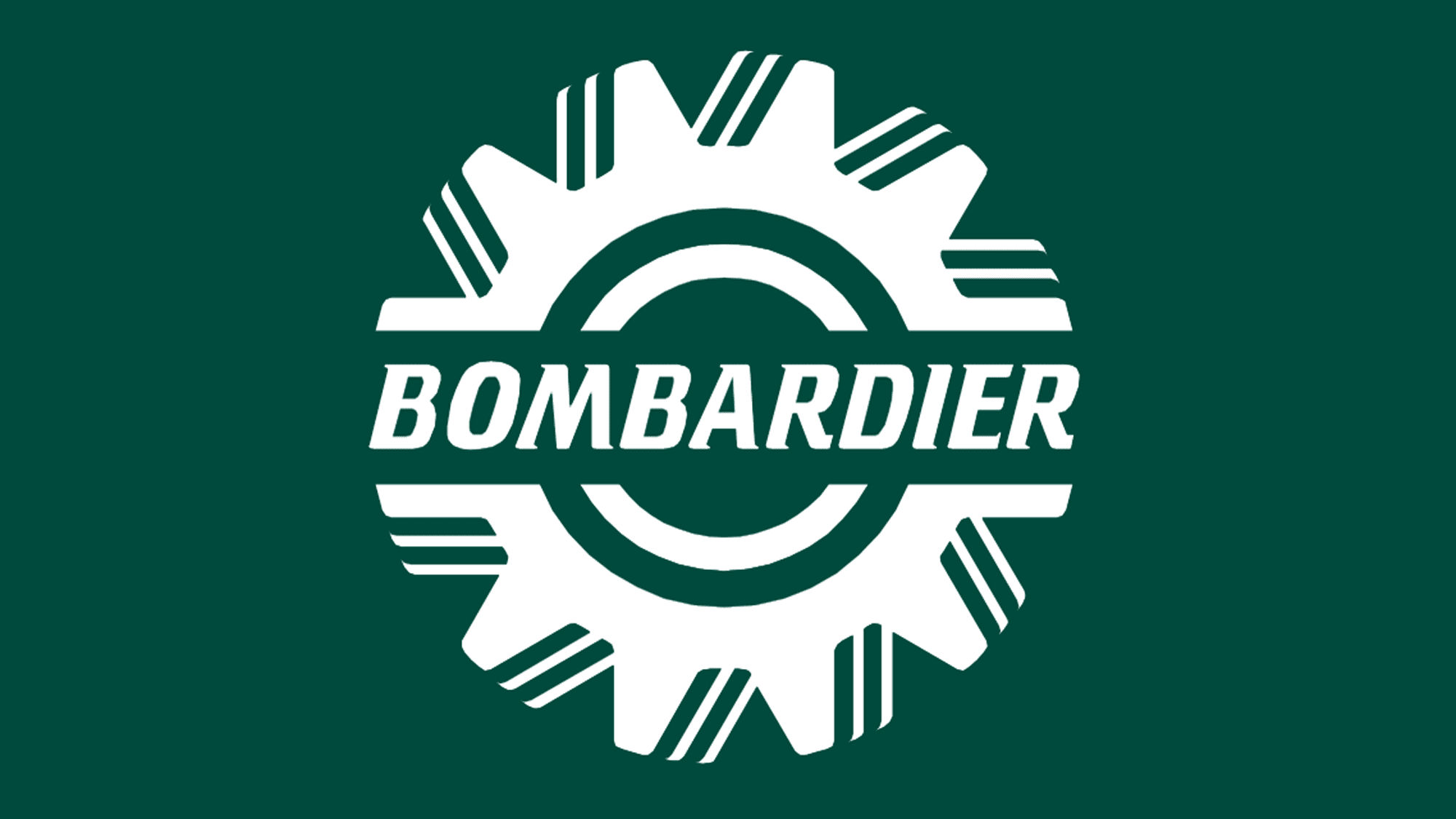
1942 – 2003
![]()
Before the company adopted its current wordmark, it had used the so-called sprocket-wheel logo. It did not remain the same – you can come across at least different versions. All of them feature a similar structure: a sprocket-wheel with the word “Bombardier” written across it (in the middle). The versions vary by color, typeface, and details of the wheel.
To begin with, there was a black-and-white logo. The type here looked pretty much the same as on the current wordmark.
![]()
Also, there was a logo in dark blue and white. While the sprocket-wheel resembled the one on the black-and-white logo described above, the type was lighter.
You can also come across a Bombardier logo in dark green and white. Here, the spikes on the wheel had rounded angles. The type was italicized and featured distinctive “thorns.”
2003 – 2024
![]()
In 2003, they decided to use just the wordmark from then on. It still used the big letters, but the font became a more upright and basic sans-serif typeface. The usual colors would be black, but it could be anything if necessary.
2024 – Today
![]()
This logo presents a stark, monochromatic theme that implies both sophistication and power. The icon above the company name consists of two pairs of angular, wing-like shapes that converge towards a central point, creating a dynamic sense of movement and precision. These shapes can evoke the idea of propeller blades or a stylized bird in flight, possibly alluding to speed, ascension, and innovation—qualities pertinent to the aerospace or transportation industries.
Below this emblem, the word “Bombardier” is written in a bold, sans-serif typeface. The letters are evenly spaced and command attention due to their weight and simplicity. The black color of the text and the icon on a white background affords a classic contrast that further underscores the logo’s clarity and focus.
The logo communicates a sense of reliability and forward-thinking, attributes valued in fields that require precision engineering and technological advancement. It speaks to an audience that values tradition and innovation, blending a timeless font with a modern symbol that propels the brand identity into a future-oriented space. The minimal use of color and detail suggests that the company prioritizes functionality and performance over frivolous design elements.


