While the overall look of the TRD logo has not changed much since it was introduced almost 45 years ago, there has been a couple of notable updates. Also, the core that has remained virtually unchanged has been supplemented with various additional elements. There has been some playing around with the colors, too.
Meaning and history
TRD (Toyota Racing Development) operates as an in-house tuning department responsible for motorsport preparation and road car tuning. In addition to working with Toyota cars, it also works with all Lexus cars and, formerly, Scion cars.
While the history of the department officially started in 1976, its roots go back around two decades ago when the Japanese carmaker entered the world of competitive motorsport.
1976 – 2015
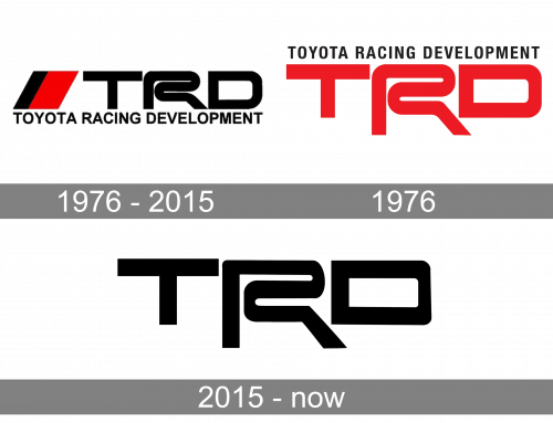
In the original version, the “R” had the same height as the other two letters. Also, the way the lettering “Racing Development” looks has not remained unchanged. In some versions, the glyphs are positioned very close to each other, while in other versions, there is enough breathing space.
In the majority of the versions, the type is lowercase with capitalized initials. Yet, you can also come across a version where all the letters are capitalized.
Versions of the logo 1976
The large three letters “TRD” have always been the centerpiece of the design. They can be seen in every version of the emblem. The highlight of the logo is the “R” imitating a race track.
Typically, you can also see the lettering “Racing Development” above. Here, the glyphs have been by far smaller and have been taken from a simpler typeface.
Additionally, you can come across versions featuring the words “Toyota Motor Sports” or “Sportivo,” as well as a red-and-white flag.
2015 – Today
Later, the company’s design team decided to put the “R” in the limelight by making it larger. Now, the two lower ends of the “R” are stretching beyond the line on which the “T” and “D” are standing. This is an excellent way to draw attention to the “racetrack” symbol, thus emphasizing the meaning of the design.
This approach was first used before 1996. When the TRD USA’s facility in Costa Mesa, Calif, was opened that year, it already used the emblem featuring the large “R.”
Colors
Throughout all its history, the TRD logo has featured two colors (black and white), typically complemented with red (a cooler tint or warmer tint). In older versions, the letters “TRD” were either white on the red background or black on the white background, while in the current version of the emblem, they are red.


