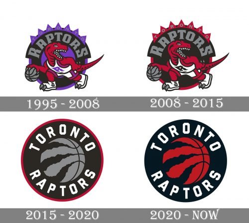
The Toronto Raptors logo history hasn’t been very long. While the original logo dwelled on the dinosaur theme, it disappeared from the following version.
Meaning and history
The visual identity history of the Toronto Raptors can be split into two periods — the Dino one, from 1995 to 2015, and the contemporary era started in 2015 with a completely new design concept.
What are Toronto Raptors?
Toronto Raptors is the name of a professional basketball club from Canada, which was established in 1995 in Toronto, Ontario. Today the club competes in the National Basketball Association, has Scotiabank Arena as the home stadium, and Nick Nurse as the head coach.
1995 — 2008
The original logo for Toronto Raptors depicted a bright red raptor in a basketball uniform, placed in a circular purple and black background with an arched inscription above it. The bold gray lettering was executed in a custom and sharp serif typeface with pointed angles and thick lines can be evoking a sense of confidence and danger.
The alternate logo, used by the club during this period featured an image of the basketball with three Dino claws above it, enclosed in a circular frame. This design will become a basis for another logo later.
2008 — 2015
The color palette of the Raptors’ visual identity was switched to red, black, and white in 2008, with all the purple elements of the background changed to black, and the monochrome uniform of the Raptor, the logo started looking more passionate and strong, reflecting the essence and the mood of the Toronto basketball club.
2015 — 2020
The redesign of 2015 brought a completely new style to the Toronto Raptors’ visual identity. The new badge featured a solid black circle in a red outline, with a white sans-serif lettering around its perimeter and a stylized gray and black basketball image in the center. The ball’s stripes resemble three raptor claw marks and are placed slightly diagonally on the left part of it.
2020 — Today
The color palette of the logo was changed to black, red, and white in 2020. With the black background white lettering and red basketball in the middle, the badge in a wide white outline looks stylish, classy, and timeless, representing professionalism, determination, and overt of her basketball club from Toronto.
Font
The global logo sports a comparatively simple block type with cut corners. Being fairly clean and clear, it seems to lack edge.
Colors
While the official color scheme comprises five colors (red, black, silver, and gold), the actual palette of the Toronto Raptors logo is different. White is used here, while gold can’t be seen, though it does appear on secondary emblems. According to the official brand guidelines, the values of the colors in the Pantone Color Matching System are as follows: 200 (red), PMS Black (black), Cool Gray 5 (silver), and 872 (gold).
RED
PANTONE: PMS 200 C
HEX COLOR: #CE1141;
RGB: (206, 17, 65)
CMYK: (0, 100, 65, 15)
BLACK
PANTONE: PMS BLACK 6 C
HEX COLOR: #000000;
RGB: (6, 25, 34)
CMYK: (30, 0, 0, 100)
SILVER
PANTONE: PMS COOL GRAY 8 C
HEX COLOR: #A1A1A4;
RGB: (161, 161, 164)
CMYK: (0, 1, 0, 43)
GOLD
PANTONE: PMS 872 C
HEX COLOR: #B4975A;
RGB: (180, 151, 90)
CMYK: (20, 30, 70, 15)


