

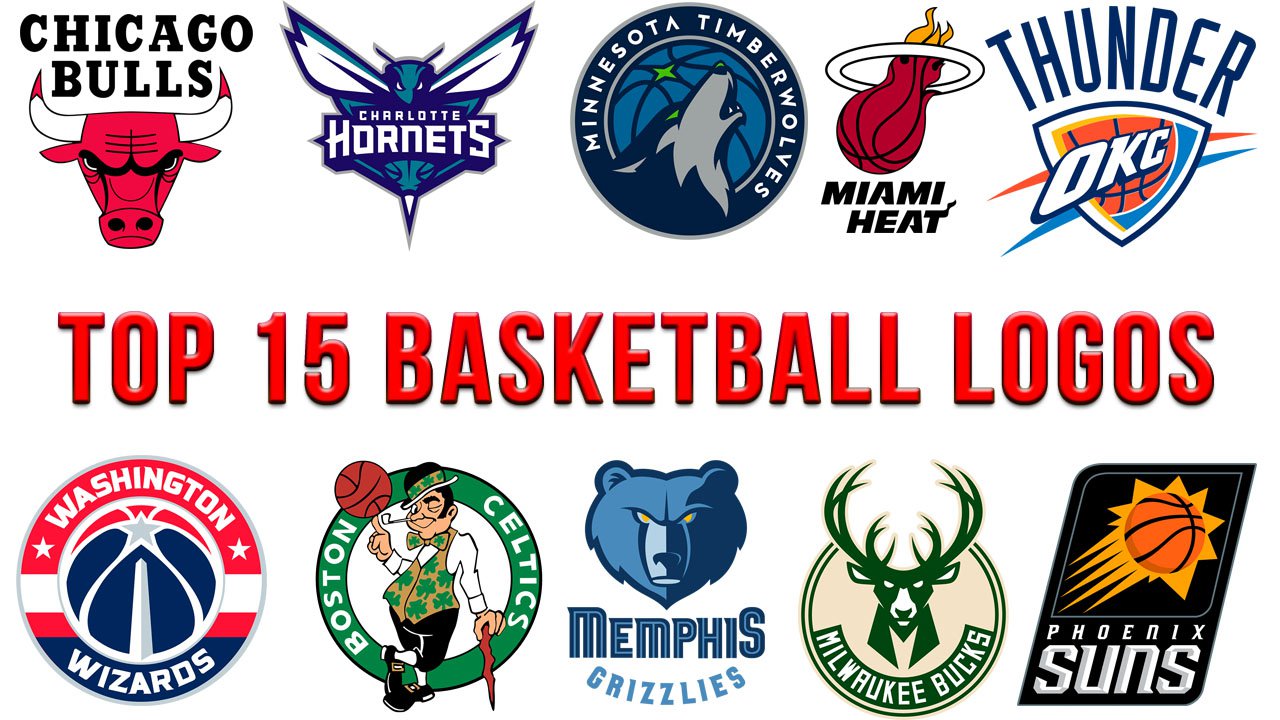
Imagine a bull running at you in the middle of a game.
Well, not a real bull – just one of the Chicago Bulls. Somewhere deep inside, all of us are metaphorical creatures, so your inner voice may be whispering: “Hey, that’s a bull going to head-butt you. You’re just a horse (Dallas Mavericks), a pelican (New Orleans Pelicans), a deer (Milwaukee Bucks), or a human (Boston Celtics). Don’t take the fight. Step back.”
Could such “thoughts” possibly slow down a player’s reaction, even for a tenth of a second?
Of course, we don’t claim that players have precisely these thoughts. They would laugh at the suggestion. And of course, there are so many other things presupposing the victory, from the professionalism of the coaches to the number of good players the club has bought.
And yet, a large part of our brain is just the so-called reptile brain – it’s simple, and it communicates through the language of symbols and metaphors. That’s why symbols affect our reactions, especially immediate and spontaneous ones. And that’s why a bull can eventually turn out to be more beneficial than a pelican for a mascot (especially if worn on the uniform).
15. Utah Jazz
![]()
We don’t see any implied motion or power in this logo. It doesn’t look very sporty and eye-catching. And yet, it does trigger an emotional response. The music theme adds a new dimension to the emblem, and this dimension is the sound. While the Timberwolves and Hornets logos also have sound, the Utah Jazz emblem is the only one in the NBA that “plays” music.
14. Denver Nuggets
![]()
While the logo looks unique and dangerously sharp, it’s pretty static and cluttered, too. Also, it’s not “sporty” enough. You can’t see any living creature, while the type is hardly legible at smaller size.
13. Houston Rockets
![]()
Can you imagine something as fast and potentially dangerous as a rocket? Also, it’s a one-color logo, which contributes to the overall emotional impact. There’s something bloody about the color and the vertical lines on the ends of the “R.”
Why haven’t we placed this one higher in our ranking? In spite of its speed and hazard, a rocket is comparatively new to our world, and thus, the emotional response it triggers can’t be compared to that of a living creature.
12. Phoenix Suns
![]()
If we had a prize for the most baseball-inspired color scheme, we would have given it to the Phoenix Suns. We like the way the sun merges with the baseball on the black background. With this palette, you may feel how cruel and even deadly the sun can be.
11. Atlanta Hawks
![]()
This is the type of logo that says much by saying little. On the left, there’s the side view of the hawk’s head, with its prominent beak. The beak implies some power and ferociousness – birds of prey have their curved beaks for tearing flesh.
In the negative space, you can make out a reverse Pac-Man design. While there’s an “I’ll eat you” message implied by the Pac-Man part, it’s also funny. Perhaps, too funny for an NBA franchise.
10. Golden State Warriors
![]()
The link with the home state is more evident than in many other logos. The Golden Gate Bridge is an internationally recognized symbol of California.
This logo may provoke a tremendous emotional response – it may conjure up the memories of the breathtaking beauty of the bridge and its vista. Also, we should mention the way it’s drawn – the lines are clean and dynamic.
On the downside, where’s sport, where’s basketball? Can it scare off anybody? You can’t win a game with sheer beauty, can you? To end up, it’s impersonal. All about the Golden State, not its warriors.
9. Milwaukee Bucks
![]()
The logo is distinctive due to the palette and shape. While it’s based on a roundel, like thousands of other logos, it’s not generic. The horns break the circle and provide an unusual twist. Also, they are sharp, which helps to convey power. The buck, which doesn’t look that friendly, has a hidden “M” on its neck.
And yet, there’s something fragile in the intricate pattern of the thin horns. It’s not the fragility of the deer depicted on the logo, but the fragility of the deer as such, especially when compared to a bull, for instance.
8. Memphis Grizzlies
![]()
A grizzly bear can be even more powerful than a bull. In bull-and-grizzly-bear fights held centuries ago, bears typically won. However, a bear doesn’t possess the bull’s speed, which is vital for a basketball game. While the palette seems rather elegant, it isn’t very eye-catching.
7. Boston Celtics
![]()
That’s an entirely different approach. The cartoonish character (the leprechaun) looks perfectly laidback and relaxed. He seems to be saying: “We don’t have to try hard, we win anyway.” Also, the sharp stick in the leprechaun’s hand may symbolize that the players are sharp, too.
While the emblem isn’t that “sporty” (in spite of the basketball), it has a unique and instantly memorable identity. Also, the history of the Boston Celtics logo dates back to the 1950’s.
6. Washington Wizards
![]()
How can a US-flag-inspired logo be unique? Look at the Washington Wizards logo for an answer. There’re a lot of symbolic details (the ball, monument, three stars representing D.C., Maryland, and Virginia, the striping from the player’s kits). And yet, the logo looks clean. That’s because all the elements merge seamlessly in a single image.
Moreover, the logo does have some “magic” to it as the monument in combination with the star resembles a magic wand. You may want to compare this emblem with that of the Orlando Magic to even better appreciate its structure and successful introduction of the “magic” concept.
5. Oklahoma City Thunder
![]()
One of the top-selling NBA merchandizes, the Oklahoma City Thunder has a “power” logo. Apart from the thunder, it shows the power of a shock wave. Can you notice the letters in the word “thunder” “flying” in different directions as if after an explosion of some sort?
Not convinced in the power of thunder? Note that many polytheistic cultures have named the thunder god the chief god of their pantheon, including Zeus in Ancient Greece, Indra in Hinduism, and Perun in ancient Slavic religion. In many other polytheistic religions, the thunder god is at least a close relation of the chief god (Norse mythology, Yoruba religion, Santería).
The shield depicted on the Oklahoma City Thunder logo appears to be the so-called Aegis, the divine shield owned by Zeus.
4. Miami Heat
![]()
While the logo of the Chicago Bulls showcases pure and rude force, that of the Miami Heat is all about the power of precision. The ball is surrounded by flames of fire – reference to the weather in Miami as well as one more way to warn that the players can be dangerous.
Also, the ball is showcased in the moment when a team scores points, which symbolizes victory. Supported by the palette, the “basketball” theme is straightforward here.
3. Minnesota Timberwolves
![]()
There’s so much in this logo – a fast and fierce mascot, basketball, Minnesota (the star is the North Star and is, therefore, the symbol of the North Star State). As the wolf has its mouth open, it means that he’s calling other animals from his pack, so, there’s also a symbolic indication of the whole team, not just one player. The green color symbolizes the landscapes of Minnesota. Also, the Minnesota Timberwolves logo has its “sound” – the howl of a wolf.
On the downside, the palette lacks contrast, so one may need to take a closer look to make out what’s drawn there, especially at smaller size.
The logo was created by the Mississippi-based designer Rodney Richardson of RARE Design.
2. Charlotte Hornets
![]()
The logo has an impressive structure: its left and right parts are partly symmetrical, while the overall emblem is based on a triangle or a three-pointed star (think a Mercedes-Benz logo placed upside down). While hornets aren’t exactly strong, they are dangerous both to other insects and humans. One hornet can kill about 40 bees a minute, while if they decide to attack a human, it can be fatal. The insect on the Charlotte Hornets logo does look like it’s going to attack: its sharp sting is clearly visible, its “facial” impression is in no way friendly.
Also, like the Minnesota Timberwolves logo, this one has its sound, the buzz of the hornets. We can’t but mention the type with its sharp “stings.”
The Charlotte Hornets logo works a bit worse at smaller size as there’re some details you can hardly make out unless the image is big enough (the baseball, for instance).
1. Chicago Bulls
![]()
Imagine you’re one of the team’s opponents. The moment you see the sharp horns of the bull, the wrinkles on its forehead, its aggressive stare, you get the gut feeling you’re going to have a tough game.
The logo works well at smaller size and is impressive at larger size. It has an eye-catching color. Also, it reminds of the team’s many victories. Think the six titles in eight years that they won during the Michael Jordan era, for instance.
And now, are you surprised the Bulls have had the same emblem since 1966? We’re not.
What about the NBA logo itself? While it’s a great emblem, we haven’t included it in this ranking. It doesn’t have to state the same message as a team’s logo, so it would have been unfair to compare it with team logos – they just serve different purposes.


