

Modern branding is incredibly diverse, there are no different symbols, both hidden and overt, that can be seen on company emblems today. Everyone is trying to reflect the nature of their brand as accurately as possible and convey the main message. One of the warmest and friendliest images on the logo is, of course, the smile. Somewhere it catches the eye immediately, somewhere it needs to be discerned and recognized, but in the end, it stays in the memory and causes a lot of trust in the brand among the audience. Today we’ve chosen for you the top twelve most iconic and interesting logos with a smile as the main symbol.
Top-12 logos featuring a smile symbol:
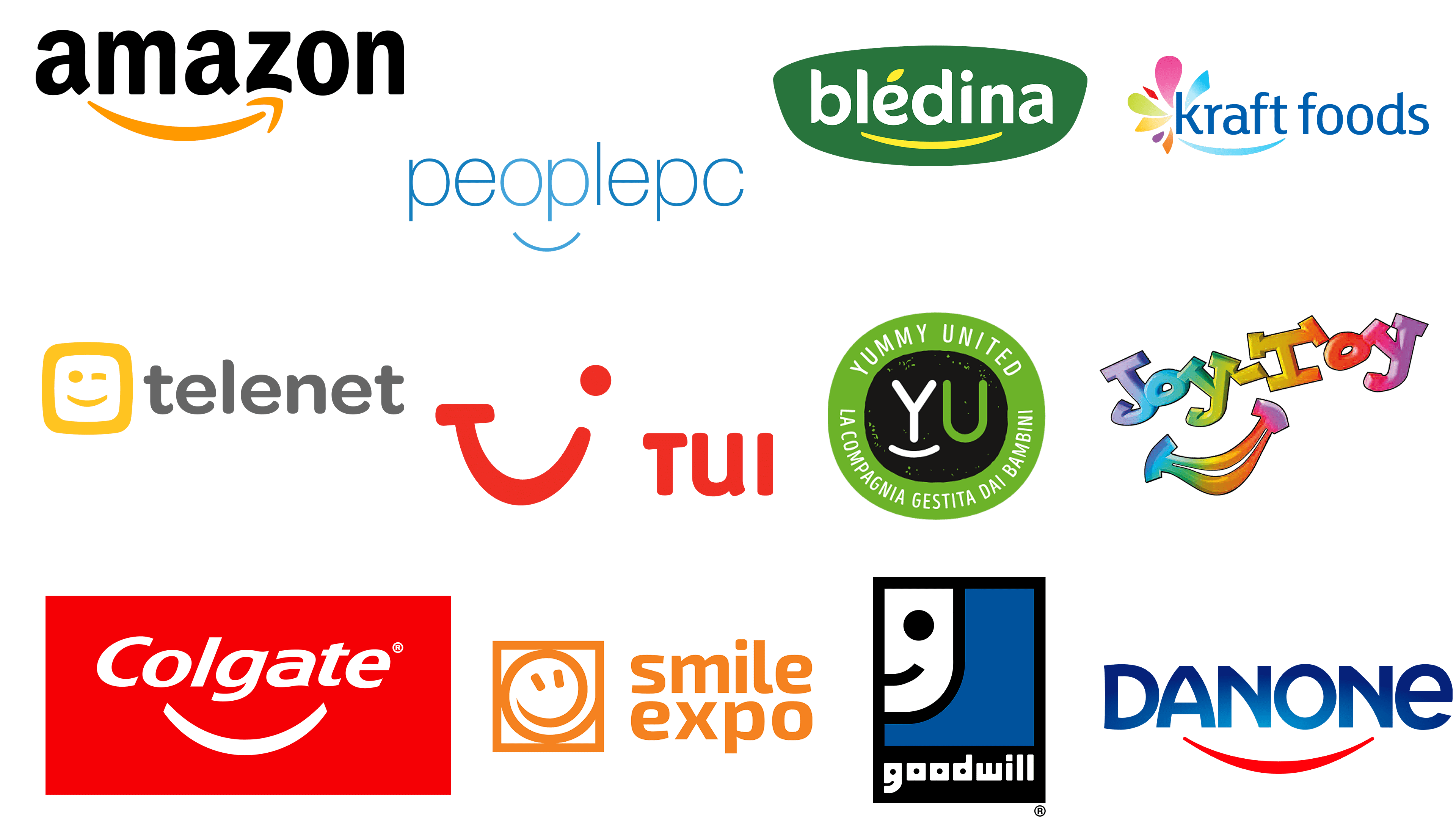
Amazon
![]()
We start with the most famous logo with a smile ever existed. Of course, it is an Amazon emblem. Amazon is an American company, one of the largest in the world among companies involved in selling all sorts of goods and services through the Internet. It is also a leader in the sale of mass-market goods through online services. And the bold orange smile stylized as an arrow brilliantly reflects the purpose of the company — delivering good emotions to clients from all over the globe. The color palette, the simplicity, and the confidence of its minimalist logo make up a perfect recipe for the successful visual identity concept.
Telenet
![]()
Another logo from our list in a similar color palette — intense yellow and black — is the emblem of Telenet, the largest provider of cable broadband access services in Belgium, which features a smile differently. The company, which business includes the provision of analog and digital cable television, fixed and cell phone services, uses a smooth square icon with a stylized winking emoji. Its boldness and energy are balanced by a very simple and muted gray logotype in gray, and this balance makes the whole composition look even softer and more kind.
Goodwill
![]()
Goodwill, an American non-profit organization that provides job training, job placement services, and other community programs for people who have barriers to employment, chose another way of adopting a smile symbol for its visual identity. Its logo with half of the smiling face is executed in a cold and professional blue, black and white color palette, which evokes a sense of reliability and somehow even looks brutal. For the clean and strict Goodwill badge, the smile is more a sign of loyalty and trustworthiness of the company, which values people and their growth in the first place. The smiley face is repeated in the letter “G” of the logotype.
Danone
![]()
The strongest competitor to the Amazon badge in our list is, definitely, Danone, a French brand, manufacturer of dairy and food products, which has its products on the shelves of the supermarkets all over the globe. The Danone logo is known by millions of people of all ages, and yes, it has a smile on it. The stylized bold red line, arched from the center, is the only graphical element, placed under a custom blue uppercase wordmark. The Danone smile is a symbol of love and care, of attention and warmth, which the brand puts in each of its products.
Bledina
![]()
Following our list of brands, which use the logo with a smile, is Bledina, a sub-brand of baby food from Danone, which was practically the first brand to bring its products from the West to Russia. Just like its mother brand, Bledina, has its logotype underlined by a simple stylized smile, which looks very delicate and elegant. The thin arched line here is executed in a bright yellow shade, which elevated the green and white palette of the badge, adding a sense of warmth and happiness, and reflecting the essence of the label’s products. The smile here is also balanced by the arched contours of the white badge’s framing.
Colgate
![]()
Another super famous logo with a smile bearer in our list is Colgate, an international company producing oral hygiene products such as various kinds of toothpaste, mouthwashes, and brushes, the brand is also involved in the production of soaps, pet food, and household chemicals. But no matter how many directions Colgate works in today, it is known as the white and healthy smile supplier, and this is what we all can see in its bold red logo. Among all other brands, using a stylized smile underline in its insignias, Colgate has it most arched, thus it does look like a smile from the first glimpse.
Yummy United
![]()
One more kid’s brand with an abstract smile in the logo is Yummy United, an international company that makes food products for children. And just like Bledina, it uses green color in its emblem, and the smile is executed in one plain bold line, under the letter “Y”. Here the arched stroke softens the vertical bar of the letter, adding balance and harmony, as the whole badge is executed in rounded shapes, starting with the thick green frame, and finishing with the green “U”. The white color of the element also elevated the meaning of loyalty and reliability.
JoyToy
![]()
JoyToy is a company manufacturing toys for children, and the smile on the brand’s logo is more than logical. It is also executed in just one arched line and perfectly inscribed in the minimalist red and white emblem with the winding key. Accompanied by a bold gray logotype, the JoyToy smile logo looks extremely modern and cool, showing the creative yet fundamental approach of the company to the design and production of toys for the most loved ones. The slightly diagonal disposition of both emblem elements makes the whole composition look even friendlier and more playful.
Smile Expo
![]()
Smile Expo, an international company that specializes in organizing large business events, has the most literate and obvious logo of all the companies on our list. There are no hidden elements or meaning, everything is depicted as it is, even the orange and white color palette is exactly what is awaited from the insignia. The gradient smiling emoji, enclosed into a square frame, has its smile-line elongated, making the circle look like a swirl, which adds a sense of infinity, like a “never-ending good mood”. And yes, this is what the company does — provides its customers with all the possible instruments for their mood and celebrations to always stay in memories.
PeoplePC
![]()
A famous internet service provider, PeoplePC, has probably the simplest, though one of the most interesting logos on our today’s list. Executed in lightweight blue lines, the insignia is based on a sans-serif lowercase logotype, with a delicate arched line placed under the letters “O” and “P” in the middle of the wordmark. The compositions of two letters and a line look like a face with two rounded eyes, a straight line of the nose, and, of course, a smile. The “smiling face” from the PeoplePC logo also features a lighter shade of blue than all other letters from the inscription, but the difference is not very obvious, and this makes the badge look super balanced and creative.
TUI Group
![]()
An iconic example of how the logotype can be represented in a smile is what we can see on the insignia of TUI Group, a German travel company from Hannover, Lower Saxony. The TUI smile has a horizontal serif on the left end of the arch, and a solid dot above the right end, so it looks like “T”, merged into an extended “U”, and finishing with an “I”. The scarlet-red shade of the graphical element is complemented by the “TUI” inscription set in the same color but a pretty simple and clean sans-serif typeface. If the emblem features a glimpse of the lowercase lettering, the logotype is set in the uppercase, and this is another interesting detail.
Kraft Foods
![]()
Last but not least logo from our smile list is a badge of Kraft Foods, the world’s second-largest packaged food company. The smile on their insignia is placed a little diagonally, underlining the last letters of the lowercase inscription, and decorated by a stylized multicolor flower above the right end of the line. This flower also looks like fireworks, reflecting the intensity of the happiness, emphasizing and elevating the sense of friendliness, love, and attention the company tends to give to all their millions of audience. On the left the smiling symbol is balanced by the red “delicious”, the last word in the company’s motto underline, “Make today delicious”, written in a modest elegant cursive typeface, smooth and friendly.


