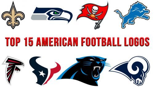
A great logo is great in many respects, from the overall concept to the tiniest detail. Before we start ranking American football logos, let’s mention some of the factors essential for a successful logo, apart from its heritage.
Most importantly, a logo should successfully convey a specific informational and emotional message. In other words, it should tell you specific facts and make you feel specific emotions. For an American football team, the desirable message may include:
- something about the team’s heritage or home city (or both)
- implied power (even aggressiveness) – in a way, the logo demonstrates the strength of the players
- dynamism (implied motion)
- pride
- American football (or at least sports)
Apart from the message, we also evaluated artistic qualities of the logos, from the palette and depth to the typeface.
While making the ranking, we took into consideration all the factors mentioned above.
15. Oakland Raiders
The Raiders logo stands out among other teams’ emblems. And yet, if you compare it with the minimalistic, stylish, dynamic, and highly symbolic New England Patriots logo, you may notice that something is missing here.
14. Dallas Cowboys
In a way, it’s similar to the New Orleans Saints logo. Like the Saints logo, it features a highly memorable symbol and emphasizes the link with the team’s home state. And it also lacks life, motion, and connection to sports.
13. Tennessee Titans
A football flying straight at you at such a speed that it’s burning? That’s not something you might be willing to catch. While there are motion and power on this logo, it depicts an inanimate object, which is a downside.
12. Arizona Cardinals
While the bird has quite an angry face, it lacks the predatory curved beak of the Philadelphia Eagle or Atlanta Seahawk. In a way, it’s more like an angry sparrow. Still, from the artistic point of view, it’s exceptionally stylish and highly memorable. It’s a single whole where each detail is at the right place and works for the overall impact.
11. Green Bay Packers
While being perfectly impersonal, the Green Bay Packers logo features a highly memorable symbol. For the designer, it was a challenge to make a distinctive logo with just a letter. The emblem looks almost the same as the 1961 one, so the Green Bay Packers logo is typically named the NFL’s oldest logo.
10. Detroit Lions
What makes this logo work is the way the lion resembles a football player. The aggressive position and the very outline of its body have something to do with a player in the middle of the game. And yet, it looks a bit flat. The choice of the mascot, the lion, is rather generic – the lion has been among the most often used symbols in all cultures and historic periods.
9. Tampa Bay Buccaneers
The flag appears to be waving, which helps to bring some motion, if not speed, to this design. It’s not just an abstract flag, but rather the one that is waving high up and leading soldiers through the fight. Also, it’s one of the very few logos having an explicit link to the type of sports – an orange football. However, the number of elements on this logo is great – the football, the ragged edge of the flag, the skull, and three sabers. This makes it a bit too difficult to perceive as a single whole.
8. New England Patriots
The concepts you notice at first glance on this logo are probably “speed” and “patriotism.” The dynamism here is evident in the shape of the flag and, to a lesser extent, the hair of the mascot. The colors have been inspired by the American flag, which makes this logo 100% patriotic.
The concept of “power” here isn’t that obvious. Eventually, that’s just a face of a human being who doesn’t have claws, horns or sharp teeth like mascots of other NFL teams. And yet, the flag over his head implies that he might be heading a whole army, which brings some power to the logo.
7. Seattle Seahawks
To begin with, the bird has a highly stylized look. It’s more of a logo than an actual bird. Also, let’s take a closer look at the overall shape. You may notice that the sharp point on the top left and bottom right corners are somewhat similar. The bottom left and top right corners are both curved. The two pairs create a visual rhyme.
The combination of navy with lime green is rather bold and unusual. The design is entirely flat, though.
6. New Orleans Saints
To begin with, you can hardly find anything that creates a link to football or at least sports. And yet, the New Orleans Saints logo is loved and admired by many fans. One of the reasons is probably that it showcases the team’s roots (the fleur-de-lis is the best-known symbol of New Orleans).
While in heraldry, the shape of the fleur-de-lis varies a lot, in case of this logo, the edges look sharp, which gives it a bit of a sporty feel.
5. Philadelphia Eagles
The emotional message of this logo may be not that obvious until you try to “finish” the design in your imagination. Can you “see” the position of the bird, the fact that it’s about to grab something? Can you feel the menacing sharpness of its claws?
What about the artistic part? The Philadelphia Eagles logo isn’t flat at all. The combination of colors is exquisite and helps to add some dimension, although it doesn’t catch your eye. You may notice that the feathers form an “E,” although the letter isn’t as apparent as on the Atlanta Falcons logo.
4. Los Angeles Rams
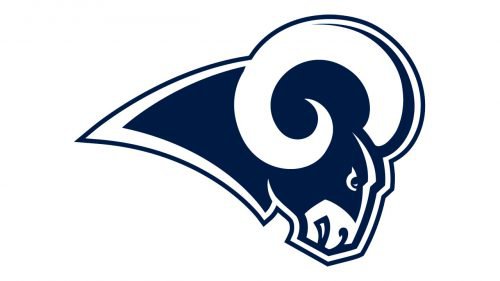
You can feel how powerful this creature is. You can feel its pace and its aggression, as well as that it’s about to hit. However, unlike the bull on the Houston Texans logo, the ram is facing directly to the right, not straight at you, which makes it look less hazardous.
Also, the shape of the horns is highly recognizable and memorable, and the overall shape of the logo is rather stylish.
3. Carolina Panthers
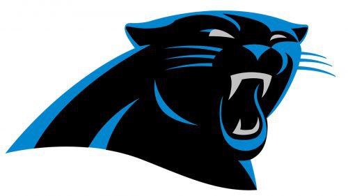
It’s one of the rare cases when aggression is depicted attractively. While you can’t but feel the hazard coming from the sharp teeth and fierce expression of the muzzle, the panther is an extremely gracious and visually appealing creature, with its curves and soft moves.
We can compare it with the Jacksonville Jaguars logo and see the difference in this respect. The jaguar on the logo doesn’t looks as attractive and addictive as the panther.
How has the author of the Carolina Panthers logo managed to make the creature look beautiful? He has chosen an impressive combination of black and bright blue, which helped to accentuate the panther’s natural curves, and added light grey to put some emphasis on the most emotionally charged elements – the teeth and the eyes.
2. Houston Texans
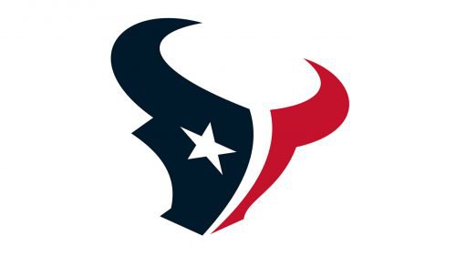
There’s a lot of great implied force and speed here. You can feel it, for instance, in the angle at which the bull’s head seems to be rotated: the creature is charging and about to head-butt something with its horns.
While you can perceive a slight 3D effect, the author of the logo hasn’t used a gradient for the purpose. It could have weakened the overall “power” of the design. With a gradient, the logo wouldn’t look so clean. Instead, the designer focused on shape – both the shape of the head itself and the star.
And also, there’s a great link with the symbolism of the state of Texas (the Lone Star Flag, in particular).
1. Atlanta Falcons
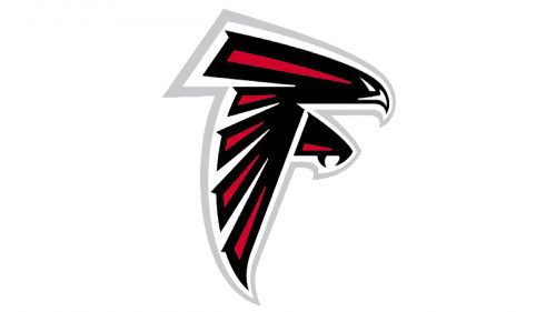
In spite of its seeming simplicity, the Atlanta Falcons logo has enough details to work well both at larger and smaller sizes. The bird is drawn uniquely and stylishly.
You can feel the speed, force, and aggression on this design, which all helps to create the emotional impact necessary for a sports logo. Also, there’s a giant “F” half-hidden in the design helping to connect the bird with the name of the team.


