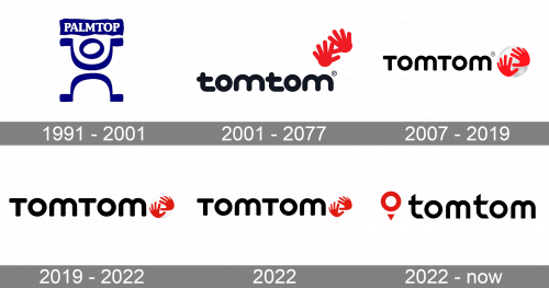
TomTom is a Dutch brand which specializes in development and production of location and navigation technology and consumer electronics. The company was founded in 1991 in Amsterdam and released its first device in 2004.
Meaning and history
The TomTom logo is bright and memorable. It consists of a wordmark and an emblem. The wordmark is bold and balanced, reflecting the company’s vision of the modern moving world.
What is TomTom?
TomTom is the name of a Dutch manufacturer of car navigation systems and software for them. It also produces software for mobile phones, communicators, and PDAs.The company was founded in 1991 by Peter-Frans Pauwels and Pieter Geelen.
1990s – 2001
The original logo of the company, introduced in 1991, was based on its initial name, Palmtop. The badge featured a drawing with an abstract human figure, formed by two Omega-shaped lines and an outlined circle, replacing the head. Above the hands of a figure, there was a softened solid blue rectangular banner with the white logotype, written in the uppercase of heavy serif fonts
2001 – 2007

The original logo, created for TomTom in 1991 was composed of bold black lettering in the lowercase placed on the left from the bright yet laconic emblem. The rounded sans-serif inscription perfectly balanced two red handprints of the TomTom icon, which was set slightly above the wordmark’s right on a white background. All the lines of the logo were smooth and thick, looking very friendly and soft.
2007 – Today
The emblem is a transparent globe with two red TomTom hands on it. The emblem shows that the brand is friendly and helpful. TomTom is a global company, aiming to create technology that customers can trust, that is the main meaning of the logo symbol.
The creative icon is balanced with a classic color palette of the logo. Black for the typeface and bright red for the hands, while the globe is executed in almost transparent gray.
The TomTom logo represents the brand as the leading specialist in its segment and celebrates the company’s motto “TomTom Technology for a moving world”.
2019 – 2022
In 2019 the emblem on the TomTom badge got a bit smaller, and the silver gradients were changed to white, making the whole logo look more laconic and balanced. There were still some gradient hues on the graphical part of the badge, but compared to the previous version, this TomTom sphere was almost flat.
2022
The redesign of 2022 has placed the red hands of the TomTom logo directly on a flat white background, on the right of the bold black lettering. All the gradients were gone, and now the badge looks clean, strong, and very progressive. In terms of size, the emblem repeats its previous version, accenting more on the lettering more.
2022 – now
The TomTom logo got another redesign just a few months later after the previous one. It is definitely the most significant change the company has made in years. The new badge features a combination of heavily stylized lowercase lettering in a modern sans-serif font with the sharp diagonally cut vertical bars of both “T”s, and a new red emblem, formed by a heavy red ring with a small triangle pointing down set under it.
Font and color
The bold and stable lettering from the primary version of the TomTom logo is set in a smooth and friendly rounded sans-serif typeface, which is pretty close to such commercial fonts as Chicken Wings Regular and Geometry Soft Pro Bold A. The lettering looks heavy, but still very well-balanced.
As for the color palette of the TomTom visual identity, t is based on the strongest and the most elegant black, red and white tricolor, which is a timeless representation of power, professionalism, and excellence.


