 Kodak Motion Picture Film Logo PNG
Kodak Motion Picture Film is a subsidiary of The Eastman Kodak Company (established unique 1888 in the United States), which specializes in the production of cameras and films since the middle of the 1980s. Kodak is considered to be one of the pioneers of the motion film industry.
Meaning and history
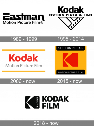
The history of Kodak Motion Picture Film started in 1995 but can be counted from 1989 when Eastman Motion Picture Film was established, and two companies merged. The logo of the Eastman label was pretty modest — composed of a bold monochrome logotype with a tagline, so it did not affect the Kodak visual identity much.
What is Kodak Motion Picture Film?
Kodak Motion Picture Film is the name of the brand of the Eastman Kodak Corporation, one of the world’s leaders in the production of films and cameras. The brand was founded in the 1980s, becoming a pioneer in the segment of motion pictures.
1989 — 1999

The logo, used by the Kodak Motion Picture Film at the very beginning of its history, was introduced in 1989 and stayed with the brand for almost ten years. It was a black-and-white composition, with the stylized “Eastman” wordmark in a bold custom sans-serif typeface underlined by the “Motion Picture Film” tagline in the title case of a traditional sans-serif font.
1995 — 2014

The original logo for Kodak Motion Picture film was introduced in 1995 and featured a bold black inscription in sans-serif, with a “Motion Picture Film” tagline in all capitals and a triangular emblem, depicting a corner of the film, pointing down. It was a stylish confident composition, which fully reflected the purpose of the company.
2006 — Today
The redesign of 2005 brought a bright color palette to the company’s visual identity— the red Kodak inscription was placed between two yellow horizontal lines. Under the main wordmark, the tagline in light gray, written in a title case was set. There was also a version of this logo in monochrome, which was used mainly for the official documents.
2015 — Today
An intense and bold emblem was designed for Kodak Motion Picture Film in 2015. It is a solid yellow square with a stylized red letter “K” in the middle. The letter’s contour resembles a film camera in profile. On the top and bottom parts of the square, there are two black banners with white lettering: “Shit on Kodak” and “Motion Picture Film”. The logo can also be executed in monochrome, depending on the needs.
2018 — Today
Another version of the logo was introduced in 2018. The stylized “K” in black has a vertical “Kodak” lettering along its right side and a bold sans-serif inscription in the right.
Font and color
The Kodak Film wordmark from the logo, designed in 2018, is written in all capitals of a traditional geometric sans-serif typeface with thick lines and distinct cuts of the letters. The typeface is very similar to such fonts as Neue Plak Black and Sequel Sans Heavy Display.
Two color palettes of the Kodak Motion Picture Film visual identity work well on various backgrounds and for different purposes. The bright yellow and red combination represents the mother company, Kodak, and makes the logo remarkable and eye-catching, while the monochrome scheme evokes a sense of expertise and professionalism, making the emblem timeless and powerful.


