Leica is an iconic brand of photo camera ls manufacturing company, established in 1869 in Germany. The company designs and produces one of the decent and most outstanding photo appliance and accessories as well as projectors and other optical devices.
Meaning and history
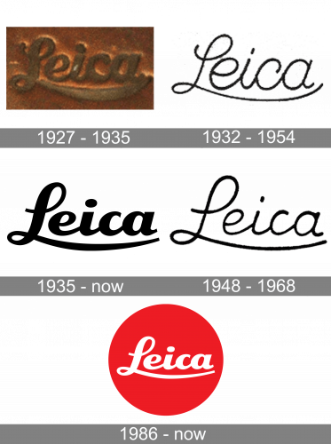
The name of the brand, Leica, is a derivative from the company’s founder, Ernst Leitz, surname and the word “camera”. However, the name occurred only in the 1910s, and before that, the firm was called Ernst Leitz Wetzlar.
The Leica iconic logo was designed in 1913, based on the Ernst Leitz signature, which was on the previous versions of the company’s visual identity designs.
The Leica logo is composed of a bright red circle with a white brand’s name inscription on it. The elegant lettering looks bold and timeless. The most recognizable component of the wordmark is the letter “L” with its elongated curved lines.
What is Leica?
Leica is a world-renowned manufacturer of premium cameras, lenses, and sports optics. The first Leica prototype cameras were developed in 1911, and the brand’s first camera was produced in 1914, which is considered the company’s foundation date.
1927 – 1935
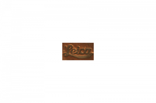
The badge, used by the German Brand in the 1920s, featured a metallic plate in copper shades with the iconic cursive lettering voluminously engraved on it. The bold smooth lines of the logotype were a bit longer and more curved than on the badge we all can see today, but the overall style was quite the same.
1932 – 1954
The redesign of 1932 introduced a lightweight Leica logotype in black. The contours repeated the shapes of the original Leica logo, but as the lines were really thin and elegant, the loops of the cursive “L” looked bigger. This version of the logo was officially used by the brand for more than twenty years x
1935 – Today

The badge, created for Leica in 1935, is still used by the manufacturers of cameras and lenses today. Moreover, it became a basis for the iconic red and white badge the whole world knows now. It was a bold black logotype with perfectly clean contours of the letters, long tails, and straight cuts of the ends. The initial version was set in plain black color.
1948 – 1968, 1983, 2002
Something in between the two previous versions was introduced by the brand in 1948. This was a lightweight cursive inscription in black, with the lines slightly thicker than in the badge from 1932, but significantly thinner than the one, designed in 1935.
1986 – Today
The typeface of the Leica logo is LG 1050, which was created especially for the brand and based on the Ernst Leitz signature.
The red and white color palette of the Leica logo is a symbol of passion and love for photography and art. It is a powerful combination, which represents the company with huge expertise and authority.
The bright red circle placed on the Leica cameras is a quality mark. The brand, lived by the world’s most famous photographers, has a perfect minimalist visual identity, which fully reflects all the values of the brand as well as its character.
Font and Color
The visual identity of the iconic German brand uses a custom script font for its instantly recognizable logotype. The smooth and bold lettering is executed in a typeface, which is pretty close to such fonts as TT Polls Script Black and Blue Star Bold Italic, but with its “L” modified — its curved elongated line, coming under the whole wordmark, adds a sense of movement and elegance to the whole visual identity.
The red and white color palette of the Leica logo is a tribute to the brand’s legacy and roots, and one of the brightest and strongest combination in the worlds of design and marketing. Red stands for passion and power, showing the strong points of the company and its ability to grow and improve, while white is a color of trustworthiness and transparency, evoking a sense of loyalty and reliability.


