The team’s roots go back to 1885. It’s one of the very few clubs that have been playing continuously and uninterruptedly since the 19th century. Today, it belongs to Minor League Baseball and is an affiliate of the Detroit Tigers.
Meaning and history

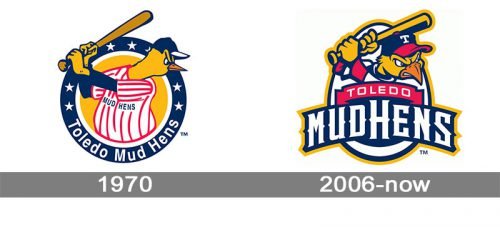
The Toledo Mud Hens logo has been rather consistent in its central theme – an anthropomorphized hen depicted as a baseball player.
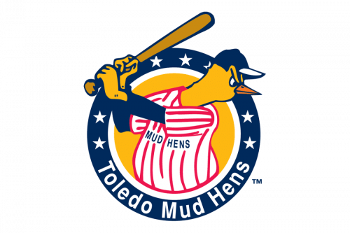
1970 — 2005
 The logo used until the 2005 redesign featured a yellow hen dressed as a player. The design was placed in a navy blue ring with white stars and the name of the team in white.
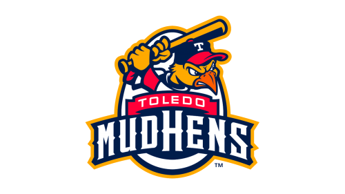
2006 — Today
The focal point of the updated logo is the same – again, we see a hen with a baseball bat. Its style and mood differ dramatically, though. Now, the creature is glaring with a wild look and is certainly not going to leave the opponent even the tiniest chance for victory. The circle shape of the previous logo has been replaced by an egg, which seems to fit the “hen” theme better. The name of the team has grown larger, more prominent and is now placed on the forefront.
Colors
The Toledo Mud Hens logo has been very consistent in its color scheme, at least since the end of the previous century. The palette is based on navy blue, red, yellow, and white.


