Toblerone, a renowned Swiss chocolate brand, stands as a testament to quality and innovation in the confectionery industry. Owned by Mondelez International, a global leader in snacks and chocolates, Toblerone has etched its place in the hearts of chocolate lovers worldwide. The company is distinguished not only by its unique triangular shape, reminiscent of the Swiss Alps, but also by its commitment to maintaining the authenticity of its Swiss chocolate heritage. Operating across the globe, Toblerone’s production extends beyond the Swiss borders, yet it maintains a significant part of its production facility in Switzerland, adhering to the strict standards set by the Swissness legislation. This legal framework ensures that Toblerone can proudly bear the title of Swiss-made, a hallmark of quality and craftsmanship.
Meaning and history
Founded by Theodor Tobler in Bern, Switzerland, in 1908, Toblerone has grown to become an emblematic Swiss chocolate brand recognized worldwide. Its inception was marked by Tobler’s innovative spirit, blending rich chocolate with honey and almond nougat to create its signature recipes. Toblerone’s history is deeply intertwined with the Swiss tradition of chocolate-making, symbolized by its mountain logo, which features the image of the Matterhorn mountain peak, and the famous hidden bear, a nod to the Swiss capital of Bern.
Over the years, Toblerone has achieved numerous milestones, including the expansion of its chocolate factory to meet growing demand and the adaptation of its recipes to comply with the Swissness legislation for maintaining the authenticity of Swiss-made products. The brand logo, a mountain, signifies Toblerone’s commitment to quality and its roots in the Swiss Alps, while the hidden image within it plays a central role in connecting the brand with the national symbols of Switzerland.
Currently, Toblerone continues to thrive under the ownership of Mondelez International. The company has faced challenges, such as modifying its production processes for legal reasons and adapting its packages to reflect more generic mountain images due to Swissness notice regulations. Despite these changes, Toblerone has preserved its heritage and continues to be a symbol of Swiss excellence in the confectionery world. The current logo, while updated, remains true to the brand’s legacy, showcasing the mountain logo and the signature of our founder Tobler, affirming Toblerone’s position as a quintessential Swiss chocolate brand.
What is Toblerone?
Toblerone is a Swiss chocolate brand known for its distinct triangular shape, inspired by the Swiss Alps. Its products, ranging from the classic milk chocolate bars to varieties incorporating different fillings and flavors, are crafted using traditional recipes that highlight the quality of Swiss-made chocolates. Toblerone’s heritage is celebrated through its iconic packaging, which features the mountain logo and the hidden image of a bear, symbolizing its origins in the Swiss capital of Bern and its commitment to Swiss traditions.
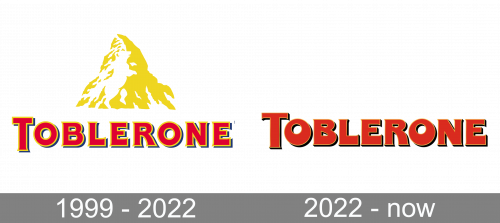
1999 – 2022
The iconic Toblerone logo, designed for the brand at the end of the 1990s, featured a combination of two bright and confident elements: the heavy geometric serif lettering in red with a yellow outline and a thin black shadow, and the yellow emblem, depicting the Matterhorn mountain. The wordmark was set in the uppercase of a custom sophisticated font, with the first letter enlarged.
2022 – Today

The logo history dates back to 1908. Chocolate bars with unusual triangular shape were created by Theodor Tobler and his cousin Emil Baumann in Switzerland. They developed a unique mixture of milk chocolate, almonds, nougat and honey and their distinctive Toblerone chocolate logo. The name of the bar is a blend word formed from the parts of “Tobler” and “Torrone” which in Italian means honey and almond nougat.
The Tobler Company used to be independent until 1970 when they joined efforts with the makers of Milka and formed Interfood. Now the Swiss brand including its Toblerone logo is owned by Mondelēz International Inc., a confectionery company from the USA.
Symbol
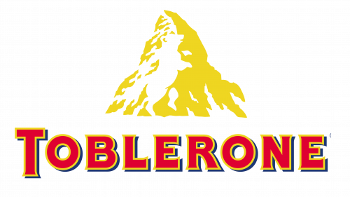
The Toblerone logo meaning is not caught at a glance. The logo consists of a picture of a mountain that echoes the shape of the chocolate bar and the word “Toblerone”. The mountain is believed to be the Matterhorn which is in the Swiss Alps. When people buy a Toblerone bar and see the mountain icon on the packaging, they are unlikely to have a good look at it. But if they did, they would notice a white bear in the mountain which is usually taken for snow.
Tobler incorporated it in the logo because Bern, the Swiss capital where the bar was created, is called the “City of Bears” and its symbol is a bear featured on the coat of arms of the city. Evidently, the Toblerone logo meaning pays tribute to the birthplace of the popular nutty treat.
The bear in the Toblerone logo is standing up on its hind legs and takes up nearly the whole mountain. It is enough to spot it once, and then you always see it.
Colors and Font
The color palette of the Toblerone chocolate logo is made up of gold (pantone 873 C), white, red (pantone 485 C) and blue (pantone 2758 C). The typeface for the lettering “Toblerone” is Meta Plus Bold Caps in red with a gold and blue outline.


