Bounty is a brand of coconut chocolate bar, launched by the Mars company in 1951. Today it is one of the most famous chocolate bar labels in the world, distributed on all six continents. By now, the name of the brand has become synonymous with the best sweet treat from tropical islands.
Meaning and history
The history of this chocolate bar dates back to the early 1950s, when the owner of Nestle introduced its first coconut-filled chocolate, called Bounty, to the market. The idea behind the product was to offer customers something new and unusual, associating it with a dream vacation on a tropical island.
In the middle of the 1990s/, the production of the exotic candy bar was moved to Europe, Oceania, and the Middle East, so now the treats are imported to the American market from European manufacturers.
Chocolate with coconut was quickly remembered by consumers not only for its original flavor but also for the holiday atmosphere that was presented by its stylish packaging and creative advertising. All Bounty commercials show tropical islands, warm beaches, clear azure water, and coconut palms. These images led to the idea of a paradise vacation and remained in the viewer’s memory for a long time.
Bounty has succeeded in becoming one of the most popular chocolate brands in the world. To this day, the brand continues to develop and expand its product range to include other types of chocolate bars. Today on the market we can find not only chocolate, but also Bounty candies and ice cream, which can be covered with milk or dark chocolate, and the flavor of the filling sometimes takes on even more tropical notes.
What is Bounty?
Bounty is the name of a brand producing chocolate bars with coconut pulp filling, covered with milk chocolate, produced by the American company Mars in Europe, Oceania, and the Middle East. It is available in two flavors — milk and dark chocolate. The Bounty bar has been on the market since the middle of the 20th century.
In terms of visual identity, Bounty is pretty direct, as its logo concept is based on the chocolate bar’s main ingredient — a coconut. Everything, starting from the typeface and finishing the background is a tribute to the tropical taste.
1951
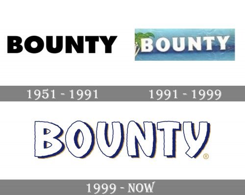
Mars introduced the chocolate bar in the United Kingdom and Canada in 1951. The original Bounty logo featured a generic sans. It was very bold, which provided excellent legibility even at larger sizes. The black-and-white composition looked pretty normal for its times, yet the exotic flavor of the product demanded somewhat more colorful and emotional, and this was brought to the Bounty visual identity with the next redesign.
1991
The new Bounty logo, introduced in 1991, seemed to be a better fit. At least the white letters with sharp “thorns” echoed the color and shape of the coconut crump out of which the bar was made. The glyphs grew lighter and so did the mood of the Bounty logo. The shape of the “B” “rhymed” with the shape of the leaves of the palm trees in the background.
1999
This time, the design of the package echoes the product and its origins even more explicitly. The central theme is the similarity between a coconut and the Bounty bar.
Both have a white filling plus a brown cover. This is why you can see an open coconut next to the wordmark and why the glyphs are white with a dark shade and dark outline.
The type has been modified in many ways adopting a more natural shape. The somewhat unpredictable curves of the glyphs are reminiscent of things made by hand or created by nature, not by the machine.
Font and color
The stylized uppercase lettering from the primary Bounty logo is set in a custom sans-serif typeface, which has something in common with such commercial fonts as That’s All Folks and Shervington, but with significant modifications of the shapes and contours of the characters.
As for the color palette of the Bounty visual identity, it is still based on the shapes of blue and brown, the colors of the sky, the ocean, and the coconut, which make up the best combination, associated with the perfect vacation.


