Jimmy John’s is a renowned American sandwich chain known for its speedy delivery and freshly made subs. Established by Jimmy John Liautaud in Charleston, Illinois, it began as a modest venture aimed at providing delicious, quick sandwiches to college students. Liautaud’s dedication to using fresh, high-quality ingredients and his unique approach to fast service helped Jimmy John’s swiftly expand, making it a popular choice for sandwich lovers across the United States.
Meaning and history
Jimmy John’s, a prominent American sandwich franchise, was born from the entrepreneurial spirit of its founder, Jimmy John Liautaud. In 1983, Liautaud, then just 19, launched his first sandwich shop in Charleston, Illinois, near Eastern Illinois University. His initial menu was simple yet appealing, featuring four sandwich varieties made with fresh ingredients. Liautaud’s dedication to quality and speed resonated with customers, especially college students seeking quick, tasty meals.
The success of the first store led to rapid expansion. By 2002, Jimmy John’s had opened its 200th store, and by 2014, the count had soared to 2,000. This growth was partly due to Liautaud’s franchise model, which attracted entrepreneurs who shared his vision for quality and efficiency.
In 2016, Roark Capital Group, a private equity firm, acquired a majority stake in Jimmy John’s, further propelling its growth. Liautaud retained a significant minority stake and continued to be involved in the business.
Renowned for its “Freaky Fast” delivery service and slogan, Jimmy John’s carved a niche in the competitive fast-food market. Its emphasis on fresh, natural ingredients and baking bread in-house daily became a cornerstone of the brand’s identity.
By 2019, Inspire Brands, a multi-brand restaurant company, acquired Jimmy John’s, adding it to its impressive portfolio of restaurants. Despite the change in ownership, Jimmy John’s continues to thrive, maintaining its commitment to quality and speed that has defined its journey from a small college-town sandwich shop to a nationwide phenomenon.
What is Jimmy Johns?
Jimmy John’s stands out in the fast-food landscape as a sandwich chain celebrated for its ultra-fast delivery and commitment to freshness. Founded in 1983 in a small Illinois town, it quickly gained fame for its high-quality ingredients and distinctive homemade bread, earning a dedicated following across the United States.
1983 – 2000
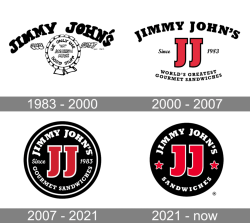
The logo of Jimmy John’s radiates a playful and bold character with its whimsical, uneven black lettering that spells out the brand’s name. A sandwich, casually illustrated, sits beside the text, reinforcing the company’s focus on food. At the center, a ribbon-shaped seal encircles the proud proclamation “We Only Use American Made Good Stuff”, a nod to their commitment to quality ingredients. The foundation year “Est. 1983” anchors the design, celebrating the brand’s enduring presence since its inception.
2000 – 2007
In this evolution of Jimmy John’s logo, the playfulness gives way to a sleeker design, boasting a more modern and streamlined look. The two ‘J’s are now bold, red, and distinctly stand out, symbolizing perhaps the two halves of a sandwich or the initials of the brand, reinforcing its identity. “Since 1983” is displayed modestly, signifying the brand’s proud heritage, while “WORLD’S GREATEST GOURMET SANDWICHES” boldly declares its culinary aspirations beneath, both encapsulating the brand’s confidence and history in a contemporary style.
2007 – 2021
This rendition of Jimmy John’s logo presents a classic circular badge design, encasing the iconic red ‘JJ’ initials within a black background, adding a stark contrast and a sense of tradition. “Since 1983” and “GOURMET SANDWICHES”, now encircle the initials, emphasizing the brand’s legacy and specialty. The use of a circular border suggests completeness and quality assurance, while the bold, capitalized font reflects a confident brand with a strong history. The overall effect is one of timeless appeal and reliability.
2021 – Today
The latest Jimmy John’s logo maintains the circular, badge-like emblem but simplifies the design. The ‘JJ’ initials remain centrally placed, yet the surrounding text has been streamlined to simply “SANDWICHES”, focusing purely on the product. Flanking the ‘JJ’, two red stars add a touch of flair, possibly symbolizing excellence and quality. This design strips away previous claims of heritage and gourmet status, presenting a more focused and minimalist aesthetic that aligns with modern branding trends. The result is a crisp, clean logo with a classic feel.


