The American Hockey League team Texas Stars was established in 1999. Today, it’s the top affiliate of the National Hockey League’s club Dallas Stars.
Meaning and history
Texas Stars, an American professional ice hockey team, was founded in 2008. The team, based in Cedar Park, Texas, is the primary affiliate of the National Hockey League‘s Dallas Stars. From its inception, Texas Stars have made a significant impact in the American Hockey League (AHL).
One of the team’s most notable achievements is winning the Calder Cup in 2014, a prestigious honor in the AHL. This victory solidified their reputation as a formidable force in the league. Over the years, Texas Stars have consistently displayed remarkable performance, often qualifying for the playoffs and demonstrating a high level of play. They have also been instrumental in developing future NHL players, contributing significantly to the talent pool of their parent team, the Dallas Stars.
In recent times, Texas Stars continue to be a prominent team in the AHL. They maintain a strong roster of players, many of whom show potential for advancing to the NHL. The team’s focus on nurturing young talent and their commitment to competitive play keeps them in a significant position within the league, attracting fans and aspiring athletes alike.
What is Texas Stars?
Texas Stars is a professional ice hockey team competing in the American Hockey League. As an affiliate of the NHL’s Dallas Stars, they focus on developing young talent for the major league.
1999 — 2001
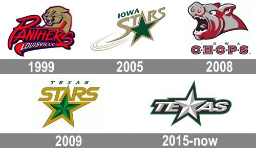
The logo from 1999 was created for the hockey club with the name Louisville Panthers. It was a bright red “Panthers” inscription with a curved elongated tail of the “S” and “Louisville” in white sans-serif capitals set on it. The lettering was placed slightly diagonally under a golden-brown image of a panther. The animal had its eyes red and outline of the same color.
2005 — 2008
The redesign of 2005 introduced a new badge for a new team. It was a gold and emerald-green logo with an “Iowa Stars” logotype and a bold five-pointed star drawn in green with a thick gold outline. The lettering was executed in a smooth and elegant custom typeface, with some lines elongated and tails pointed. That was a very light and sophisticated badge with stayed with the club for almost three years.
2008 — 2009
The Start in the name was switched to the “Chops”, and the logo was changed dramatically. Now it was a red and black badge on a white background. The gray and red pig image was drawn above the two leveled inscription with black “Iowa” in small caps and a lot of space between the letters, and a bold outlined serif “Chops” in red, white, and black, with the letters separated by solid black dots.
2009 — 2015
The earliest logo, which was revealed in 2009, featured a green star with a gold outline. The word “Stars” was given in large gold letters, while the text “Texas,” in smaller green letters, was placed above.
2015 — Today
The 2015 update preserved the core elements of the logo and made the design more minimalistic and clear. Now, the star was positioned in the middle of the word “Texas” replacing the letter “X.”
Colors
The Texas Stars logo is dominated by silver and white, while Victory Green makes the color palette unique. Black is used for the finishing touches.


