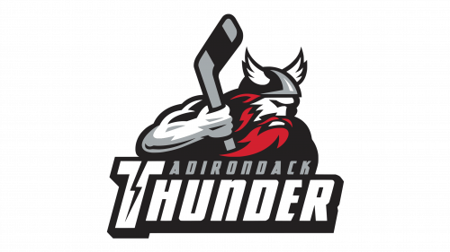
Fans heard the name “Adirondack Thunder” for the first time in 2015. That year a well-known hockey team Stockton Thunder left Stockton, California, for the city of Glens Falls, New York, to replace there Adirondack Flames. As a result of the relocation, the team started calling themselves “Adirondack Thunder”.
Meaning and history
Adirondack Thunder, a professional ice hockey team, was founded in 2014 and is based in Glens Falls, New York. The team plays in the ECHL, a mid-level professional ice hockey league, and they are affiliated with the New Jersey Devils of the National Hockey League (NHL). The formation of the team marked the continuation of a long tradition of hockey in the Glens Falls region, following the relocation of the Adirondack Phantoms.
Throughout their history, Adirondack Thunder has achieved notable successes. They have been a competitive force in the ECHL, particularly highlighted by their performance in the 2017-2018 season when they reached the Conference Finals. This achievement showcased their capability to compete at a high level and brought significant attention to the team. The Thunder’s games are known for their energetic atmosphere, drawing a dedicated fan base that supports the team passionately.
In recent years, Adirondack Thunder has maintained a stable position in the ECHL. They continue to develop young talent, contributing to the broader hockey ecosystem by nurturing players who may advance to higher leagues, including the NHL. The team remains an integral part of the local community, both as a source of entertainment and as an ambassador for the sport of hockey in the region.
What is Adirondack Thunder?
Adirondack Thunder is a professional ice hockey team in the ECHL, affiliated with the NHL’s New Jersey Devils, known for competitive play and community involvement.
1992 — 2001
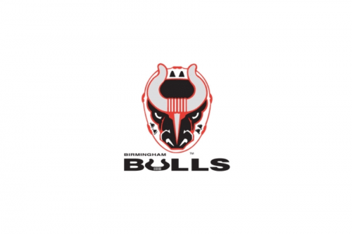
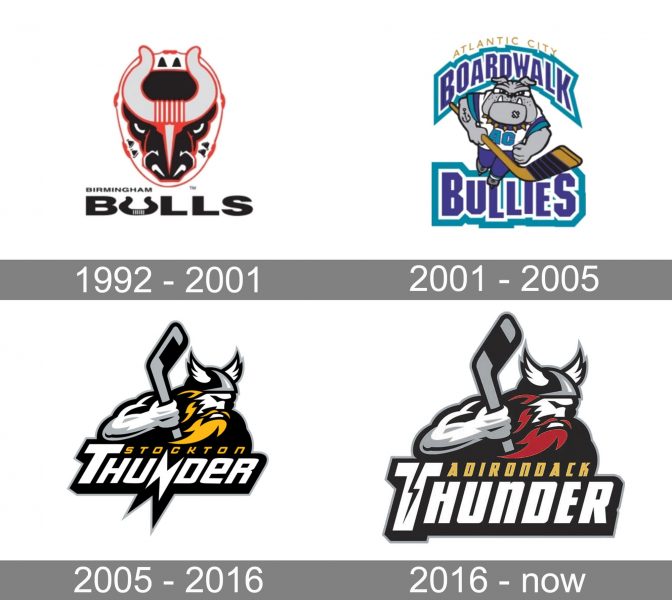
The initial name of the Adirondack Thunder club was Birmingham Bulls, and this was the wordmark from the team’s original logo. It was a black, red, and gray composition, usually placed on a white background for better contrast. The emblem, placed above the bold black inscription, depicted a stylized head of a bull with smooth bold horns and eyes evoking a sense of danger and power. The “U” in the uppercase “Bulls” was replaced by a horseshoe.
2001 — 2005
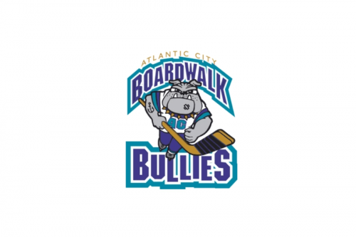
The new name and logo were introduced in 2001. Atlantic City Broadwalk Bullies badge was executed in a completely different style, using a blue and gray color palette and modern massive letters in a double outline, placed around a caricature of a gray Bulldogs I think a hockey stick. The dog had a black anchor tattoo and was wearing a white jersey with a light blue “AC” monogram. The “Atlantic City” inscription was arched about the badge and written in thin yellow capitals, balancing the heaviness of the main part of the logo.
2005 — 2015
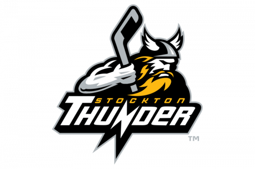
The team changed its name to Stockton Thunder in 2005, and the new emblem was designed in the same year. A modern and powerful image of a Viking with his hair yellow and head and body in gray and white was placed above the slanted sans-serif wordmark set in two levels. The upper level featured a yellow “Stockton” in small capitals, while the main part of the logotype, the “Thunder”, was written under it in large white uppercase letters, with the first “T” bigger than others, and the “N” stylized and sharpened.
2015 — Today
The administration wanted a new identity for the hockey team, not only a new name, but also and a new logo. Paying tribute to the traditions and value of Stockton Thunder that had been in the ECHL for 10 years, decision was taken to preserve the name “Thunder” but to use it with “Adirondack”.
Logo and Colors
What concerns the logo, it is much the same as the emblem used by the Thunder when they resided in Stockton. It is the same god of thunder to give the logo a bold look, the same hockey stick in his hand. However, the color of the beard changed. Now it is red, not yellow. The wordmark “Adirondack Thunder” is placed below the image of the god against a black background. It comes in two different fonts and colors ‒ the word “Adirondack” is gold and the word “Thunder” is white. A lightening bolt divides the letter “T” into two parts.
The logo features all the team’s official colors ‒ black, gold, silver, white and red.


