Rochester Americans logo PNG
As an ice hockey team with a more than half a century history, the Rochester Americans have gone through several logos.
Meaning and history
The Rochester Americans, a professional ice hockey team, were founded in 1956 by Leslie Bissonette. This team, based in Rochester, New York, is a prominent member of the American Hockey League (AHL). Over the years, the Rochester Americans have carved a niche for themselves in the world of ice hockey, marked by remarkable achievements and a loyal fan base.
Central to the Rochester Americans’ history is their legacy of success. They have clinched the prestigious Calder Cup, the AHL’s championship trophy, multiple times, with their most recent triumphs in the 1980s and 1990s. Their impressive record extends to numerous playoff appearances, showcasing a consistent level of high performance and resilience. The team has also been a breeding ground for talent, producing several players who have gone on to achieve significant success in the National Hockey League (NHL).
Today, the Rochester Americans continue to hold a significant position in the AHL. They maintain a strong partnership with the Buffalo Sabres, serving as their primary developmental team. This relationship ensures a steady flow of emerging talent, contributing to both the Sabres’ success in the NHL and the Americans’ continued prominence in the AHL. As they look towards the future, the Rochester Americans remain dedicated to nurturing hockey talent and upholding their legacy in the sport.
What is Rochester Americans?
Rochester Americans is an esteemed professional ice hockey team in the American Hockey League. Known for their multiple Calder Cup victories and role as a developmental team for the Buffalo Sabres, they continue to be a key player in the AHL.
1956 — 1957
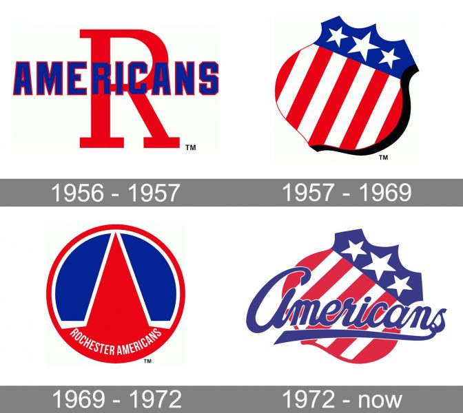
The original Rochester Americans logo, which was introduced in advance of the 1956/57 playing season, featured a large red “R” with the word “Americans” in smaller letters placed over it.
1957 — 1969
Only three years later, the team adopted an emblem that looked like a shield shape cut out of the American flag. The shield was rotated diagonally.
1969 — 1972
After using an emblem looking like a red mountain in a circle for one playing season in 1971/72, the team returned to its American flag shield.
1972 — Today
Now, the crest was rotated at a different angle and had the team’s name written across it. It was slightly updated two times.
Colors
What has remained almost intact, except for minor shifts, throughout more than 50 years of the team’s history, is the color palette inspired by the American flag.


