Terex Corporation is a US manufacturer of lifting and material handling products for several industries, from construction to mining and transportation. The brand is best known for its aerial work platforms and cranes.
What is the symbol of Terex Corporation?
The symbol of Terex Corporation is a stylized geometric crown, composed of a rhombus and two triangles, placed above a thin horizontally stretched rectangle, and enclosed into a thin square frame. The crown stands for the height quality and expertise of the company, pointing to the professionalism and experience of Terex.
Meaning and history
The company’s origins can be traced back to 1909 when the Euclid Crane and Hoist Company was founded in the US. In 1968, General Motors had to divest the Euclid brand. However, it still owned an earthmoving division, which was renamed Terex. The name of the brand is a combination of the Latin words “Terra” (meaning “Earth”) and “Rex” (meaning “King”).
The first vehicles bearing the Terex logo featured just the lettering “Terex” in a bold sans serif font without the iconic emblem.
What is Terex?
Terex is an American company, which was established at the beginning of the 1930s, and has always been engaged in the production of construction equipment and machinery, with an emphasis on lifting and material handling segments.
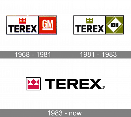
1968 – 1981
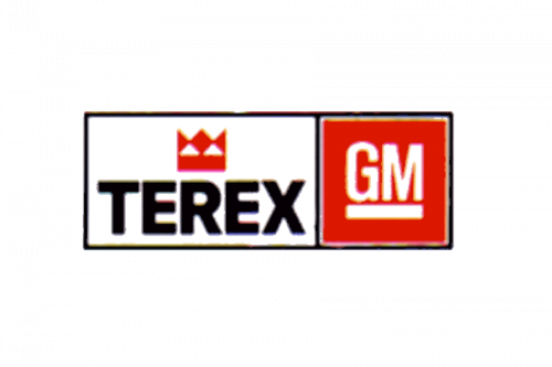
It was their initial logo: a wide rectangle joined by a square of the same height on the right. Both were black outlines with some contents inside. For the former, it’s a big word ‘Terex’ made in bold sans-serif letters with a red crown above. The latter is mostly red, with a white ‘GM’ bit made in white.
1981 – 1983
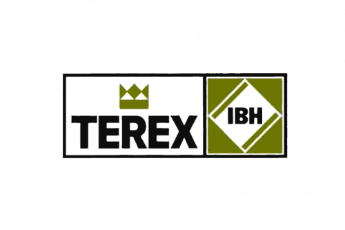
In the 1981 version they basically swapped all the red bits with yellowish-green. Moreover, the square part now held a white rhomb with the black letters ‘IBH’ inside.
1983 – Today
Later, the company added an icon featuring a maroon shape symbolizing the company’s products and a crown. The maroon “crown” was placed inside a black rectangle with slightly rounded corners.
Terex Corporation emblem
While the design looks pretty much the same as the brand’s primary logo, you can also notice a couple of notable differences. To begin with, there is a maroon stripe under the wordmark. The stripe houses the word “corporation” in white in a simple sans serif type.
The word “Terex” itself looks different than in the primary Terex logo – here, the bottom left end of the “X” is stretched. It overlaps with the maroon strip adding a unique and bold touch.
Font and Color
The bold geometric lettering from the primary Terex badge is set in a heavy modern sans-serif typeface with thick lines and clean contours of the characters. The closest font to the one, used in the Terex insignia, is, probably, Wallnutt Corps Regular, but with some minor modifications of the glyphs.
As for the color palette of the Terex visual identity, it is based on a classy and traditional combination of black and red, with white background of both the logotype and the emblem. This powerful and elegant tricolor is a timeless color combination, which evokes a sense of professionalism and precision.


