Among all known fashion dolls, Barbie is, definitely, the best-selling and most notable one. Inspired by a German doll, Ruth Handler, a businesswoman from the USA, designed Barbie.
Meaning and history
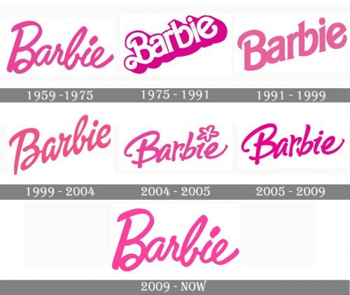
The Barbie visual identity is one of the not many examples when the brand comes back to its original logo version after numerous redesigns. There were five major redesigns of the Barbie emblem, but in 2009 the company decided to return to its roots, adopting the very first version of the fancy girly logotype as its official logo again.
What is Barbie?
Barbie is the world’s most famous brand of dolls, which was established in the United States in 1959 and owned by the international Mattel Company. The brand, which started its path with the production of just one doll, called Barbie, has expanded into a global franchise, which today has all the possible types of products, including magazines, fashion items, and toys.
1959 — 1975
The original Barbie logo, introduced in 1959, was composed of a bright pink inscription in custom cursive with letters slightly numbing above the line. The first letter was capitalized and a bit enlarged, having its left part straight, with no curves. It was a simple yet very stylish and memorable logotype, which stayed with the brand for more than 15 years.
1975 — 1991
The redesign of 1975 brought another long-lasting version of the emblem for Barbie, it was a diagonally locates inscription in white bold sans-serif, outlined in bright pink with the pink wide shadow. The letters of the wordmark had their ends thickened and rounded, and the capital “B” boasted curved elongated tails.
1991 — 1999
The diagonal orientation of the logo remained untouched, though the pink color got lighter and calmer and the typeface was changed to a more modern and strict one in 1991. The tender pink inscription was executed in a narrowed sans-serif with smooth sleek lines, with no outlines or shadows.
1999 — 2004
The redesign of 1999 brought back the bright and intense shade of pink, making the logotype in smooth cursive again, confident and trendy. The logotype was still located slightly diagonally, but the angle became smaller.
2004 — 2005
The new inscription in fuchsia was brought to the Barbie visual identity in 2004. That was the only logo with a small graphical element in it — the dot above the “I” was replaced by a stylized hand-drawn flower in the same color.
2005 — 2009
In 2005 the flower was removed from the emblem, and the solid pink dot returned. The inscription, which featured a handwritten typeface with fancy letters, looked playful and friendly, staying girly.
2009 — Today
The brand came back to its original logo version in 1959, keeping all the details of it unchanged, as it is a perfect representation of the Barbie character, mood, and style.
Symbol
The current Barbie logo is just another version of the very first one. It is just the name written in a hand-drawn typeface.
Emblem evolution
When we delve into the evolution of the Barbie logo, we’re not just discussing a signature brand; it’s a journey through the iconic brand’s visual identity that mirrors the changing perceptions and roles of the Barbie doll itself. The first Barbie logo, with its handwritten cursive font, embodied a spontaneity and charm that resonated deeply with little girls and collectors alike. Among all the iterations the logo has undergone, the first logo stands out for its simplicity and novelty, with the bright pink wordmark capturing the essence of Barbie pink that would become synonymous with the doll’s femininity and glitter.
This original emblem was a marvel in logo design, where each letter, crafted in a soft-script font known as Barbie medium italic, played a vital role in conveying the Barbie doll idea—a mix of comfort, fashion, and the ability to assume adult roles from movies to adult doll scenarios. The playful unevenness of the first Barbie logo—where the “B” dipped low and the “ar” soared high—suggested a dollie script that was both naughty and adorable, much like the paper dolls and regular dolls that preceded Barbie in the toy industry.
As the logo design elements of Barbie evolved, the brand introduced a 3D version in the decade following its debut, moving away from the effortless elegance of the cursive font to embrace a modern font that reflected recent years’ trends in the fashion industry. By 1975, the logo redesigns shifted dramatically; the previous logo’s whimsicality was replaced with a uniform height across the letters, save for the initial “B”, which featured distinctive curves, adding a script touch that hinted at Barbie’s full name, Barbara, and her companion Ken (often referred to as Kenneth in full), reinforcing the Barbie doll collection’s connection to creatives and young girls.
This change in logo design not only marked a novelty in visual identity but also mirrored a shift in the Barbie doll narrative—from a children’s toy to a symbol of femininity and empowerment, capable of exploring various adult roles and careers. The iconic logo became a beacon of inspiration for young children and adult collectors, reflecting Barbie’s versatility and the brand’s adaptability to fashion trends and societal shifts.
The 1990s introduced another era for the Barbie logo, with a nod to the iconic brand’s heritage yet a clear step towards a more contemporary and relatable image. This era’s logo, while simpler, retained an effortless elegance, with sharp angles replacing the thicker ends, suggesting a girl-next-door vibe but still sophisticated and well-behaved—much like the adult doll stepping into more adult roles, from starring in a Barbie movie to influencing the fashion industry.
The shape of the letters in the 1999 logo, and its subsequent iterations in 2004 and 2005, harked back to the original logo’s effortless elegance, reinforcing the Barbie brand name as not just a children’s toy but an iconic figure in popular culture and the fashion industry. The current logo stands as a testament to the evolution of the Barbie logo, embodying the simplicity, novelty, and iconic status that the Barbie doll and its logo design have achieved over the decades, captivating the hearts of little girls, young girls, and collectors with its enduring charm and signature brand identity.
Colors
Candy pink has been one of the most important parts of the Barbie brand. The 1975 version featured a slightly cooler shade of pink than its predecessor. As for the color of the 1990 logo, it looked closer to the original logo than to the 1975 version, although it was somewhat lighter. The following logos grew more saturated.
Font
What is Barbie’s signature color?
The signature color of the most famous toy franchise for girls is, of course, pink. The most feminine and tender color represents style, elegance, and playfulness. Pink is the first color associated with girls of all ages, and Barbie is also a girl, a lady, who loves pink more than any other color, and uses its various shades for her wardrobe.
Why is the Barbie logo pink?
The logo of Barbie is executed in a deep shade of pink, which is closer to fuchsia. This is the signature color of the franchise and the most associated with the soul and the core of the brand. Pink is the color of style and elegance, the girly and tender shade, which evokes a sense of sophistication and style, and looks very playful and feminine.
What is the logo of Barbie?
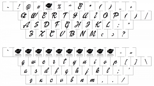
The Barbie logo is a custom cursive wordmark, written in the title case of a designer typeface, which was created exclusively for the brand. The lettering is set in dark and bright shades of pink, and has the contours of the characters softened and sleek, perfectly representing the essence of the brand.


