Thermo King Corporation is a US firm manufacturing temperature control systems for freight transport, including trucks, railroad cars and shipboard containers, as well as climate control equipment for passenger transport. The company was founded in 1938 by a businessman Joseph Numero in cooperation with an engineer and inventor Frederick Jones. In July 1940 Jones got a patent for his invention, a mobile air-cooling unit which was used to create a refrigerated truck that became a historic landmark in the transportation of perishable food items. Today the company has its production facilities in Europe, Australia, Asia and the Middle East, as well as in Africa.
The logo, its meaning and history
1945 – 1965
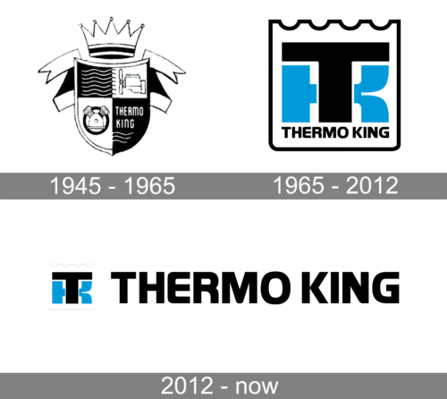
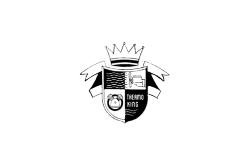
The original Thermo King logo, created in 1945, has stayed with the company for twenty years and looked very elegant and classy. It was a black-and-white composition with a traditional crest in the center, a sharp crown above it, and a white ribbon in a thin black outline set on the sides. The crest was separated into four segments, with the name of the company written in white and narrowed capitals across the bottom right fragment in black.
1965 – 2012
The redesign of 1965 has introduced a completely different version of the Thermo King badge, with a new black, blue, and white color palette, and stable geometric elements. The crest became more square, with rounded angles and the top part in a geometric line, resembling a castle wall. The white background was balanced by a thick black outline, and the central part of the crest comprised an extra-heavy “TK” monogram, where the blue “K” was overlapped by the black “T”. The monogram was underlined by a small “Thermo King” uppercase inscription in black.
2012 – Today

Initially, the Thermo King logo was very concise. It consisted of a black circle with white counter background on which there were two block letters. The left one was a blue “T” to the stem of which there were connected a leg and an arm forming a letter “K”. Next version had separate letters “T” and “K each having its own stem glued to each other. The “K” has a very short stem and disproportionally long arm and leg.
The current logo was updated in August 2012. It has a square with a white background field and a black border. The two lower corners are rounded and the top border line is wavy. There are the same two block letters meaning the company’s trademark, but this time the letter “T” is in the foreground and the letter “K” is smaller and placed behind it. The letter “T” and the border of the square are made in a charcoal grey tone. The letter “K” is in cerulean blue.
Below the emblem is written the full brand name, “THERMO KING”. The graphics of the wordmark are very close to the font Neue Helvetica Paneuropean 83 Extended Heavy except that the corners of the letter “E” are more rounded and the “R” has lost its serif element. There is also another version of the logo, in which a smaller emblem with two letters is placed on the same line as the wordmark and to the left of it.
For the customers of the company, Thermo King logo is associated with innovative technologies and reliable unique refrigerating equipment which assists to keep the so-called cold chain ensuring the proper delivery of food products from the producer to the customer.


