Super 8 (previously known as Super 8 Motels) is the world’s largest budget hotel chain, a subsidiary of Wyndham Hotels and Resorts. There are more than 2,900 properties worldwide.
Meaning and history
It all started with a marketing association. It connected individually-owned hotels that worked with the business begun by Dennis Brown in 1972. In 1973, Ron Rivett and Dennis Brown established the Super 8 Motel corporation.
The name “Super 8” reflected the fact that the original room rate was US$8.88.
What is Super 8?
Super 8 is the name of an American chain of motels, which was established at the beginning of the 1970s, and by today has grown into the world’s largest company in the motels-operating business, with more than two thousand locations worldwide.
1982
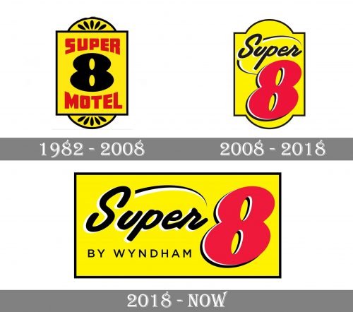
The Super 8 logo of that era was inspired by a classic house number plaque. The number “8” in black dominated the design. It was bold and heavy. The words “Super” and “Motel” were placed above and below it (respectively). In contrast with the number, the lettering was red and featured a bit lighter type with a squarish basic shape. The lower part of the word “Super” and the upper part of the word “Motel” were arched, to reflect the shape of the “8.”
At the top and the lower part of the logo, there were yellow segments with black decorative elements, like on a classic house number plaque. There was even a black dot above imitating a nail.
2008
While the shape of the logo still resembled a house number plaque, the emblem inside adopted a different style – dynamic and more minimalistic. There was more dimension, too.
The number “8,” which was now red, was italicized, which is a well-known way of adding implied motion. The swooshes worked for the same purpose. The word “Super” featured a cursive script imitating handwriting.
The word “Motel” disappeared altogether, as well as the decorative elements at the top and in the lower part of the emblem. Due to this, the updated design didn’t look as cluttered as its predecessor.
Eventually, the white and black highlights added some depth.
2018
This one looks more like the 2008 version than the original. It has preserved the bold and italicized “8,” the cursive “Super” with the swooshes, and the yellow background.
This time, the designers have added the lettering “By Wyndham” to refer to the parent company. Also, the overall shape of the Super 8 logo is now a rectangle, which made the design cleaner.
Font and color
The bright and intense Super 8 logo has two styles of the inscription on it. The bold enlarged “Super” is executed in a stylized custom handwritten font, which is a little bit similar to Deluge Regular, while the uppercase “By Windham” is set in a clean and modern sans-serif font, close to P22 Underground CY Demi Petite Caps.
As for the color palette of the Super 8 visual identity, it is based on yellow and red with black and white accents, adding professionalism and stability to the shades, and evoking a sense of dynamics and energy.


