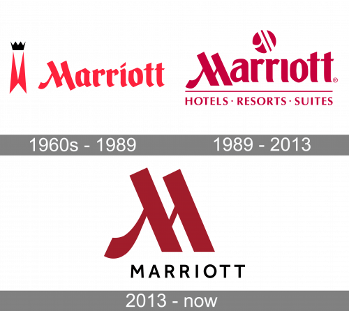
The current Marriott logo introduced in 2013 has a more sophisticated look than the previous one, getting rid of the double “M” of its predecessor.
Meaning and history

The Marriott visual identity was designed in 1976, and since that time its iconic recognizable style has been kept with almost no changes. The only redesign of the company’s logo was held in 2013, and it was more a refinement, which elevated the image and made it stronger and more modern.
What is Marriott?
Marriott is the name of one of the world’s largest and most famous hotel chains, which was established in the United States at the end of the 1920s. Today the chain manages more than eight thousand hotels across the globe. The Marriott Group owns several luxury hotel brands.
1960s – 1989
The very first logo was designed for the Marriott hotel chain in the 1960s and stayed with the company for more than two decades. It was a bright-red and black composition, set against a white background, with the bold red logotype in a fancy gothic-style font, which is still recognized today, and an emblem, set on its left. The Marriott emblem is a stylized narrow and tall letter “M”, formed by two triangles, and decorated by a solid black crown with four peaks.
1989 – 2013

The original logo for Marriott was introduced in 1976 and boasted a stylized crimson logotype with an emblem above it and a tagline under a thin horizontal line. The wordmark of the brand was executed in a custom fancy typeface with slightly curved and pointed ends of the thick letter lines. The main hero of the emblem was the first letter “M”, which was composed of two equal overlapping parts, resembling a mirrored lambda. The “Hotels. Resorts. Suites” tagline was written in a straight and clean Sans-serif, using only capital letters.
As for the emblem, it was a solid crimson circle with a white symbol in it. The symbol repeated contours of the iconic “M”, though one thin diagonal line was missing.
2013 – Today

The elegant logo was strengthened and elevated in 2013. The new composition is built around the iconic “M”, which is drawn in burgundy red and placed above a laconic yet confident black “Marriott” wordmark in all capitals. The inscription is executed in a modern Sans-serif typeface and has a lot of space between its letters.
The brand’s signifier, a stylized “M”, remained almost untouched, just got its contours cleaned and slightly narrowed.
Font
The name of the hotel is given in a perfectly legible sans serif uppercase typeface.
Color
The iconic combination of the white background and the saturated shade of red is among the distinctive features of the Marriott logo.


