

![]() Four Seasons Logo PNG
Four Seasons Logo PNG
A popular hotel chain, Four Seasons traces its history to 1960.
Meaning and history
![]()
The company was founded by Canadian businessman Isadore Sharp. Sharp, who was an architect, designed a motel for a person he knew, and the motel became a success. Sharp decided to build a hotel of his own, and in 1961, the Four Seasons Motor Hotel opened in Toronto.
What is Four Seasons?
Four Seasons is the name of one of the most famous luxurious hotel chains in the world, which was established in Canada in 1960, and by today has opened more than 120 hotels in almost 50 countries across the globe.
1960 – 1978
![]()
The previous Four Seasons logo looked pretty much like the current one, although, in fact, there are a lot of minor differences.
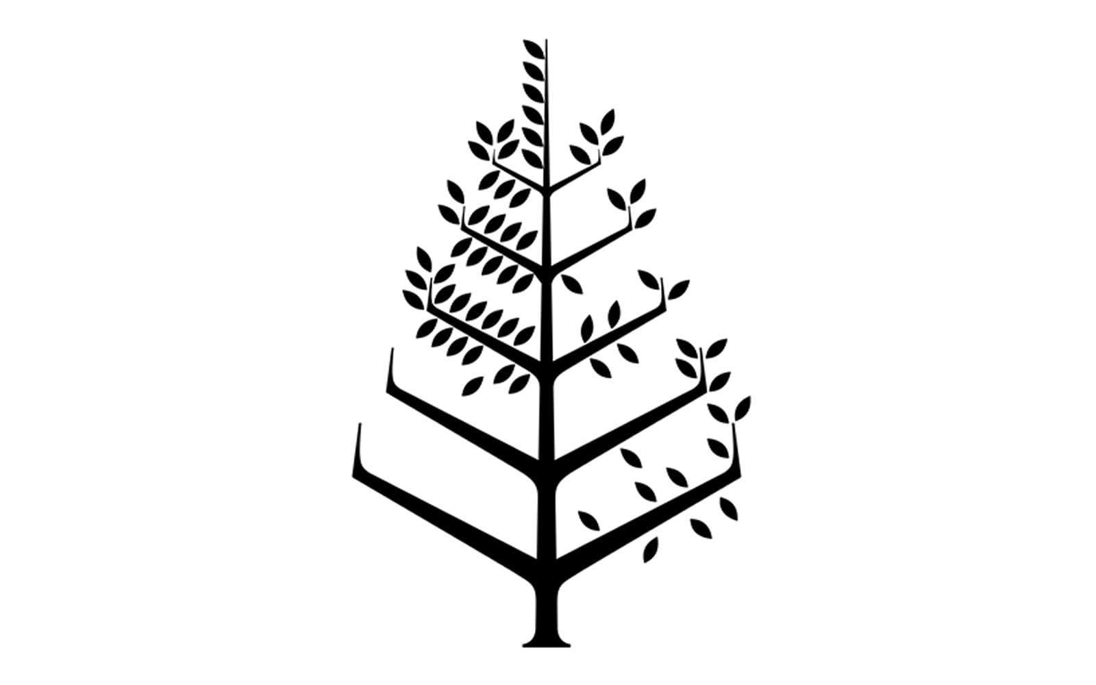
The centerpiece of the design is a tree symbolizing the transition from one season to another. In other words, it is a picture representing the hotel’s name. The branches can be divided into four groups, each symbolizing a different season.
The most obvious one is the lower left part, where the branches are bare (the winter). Above, the branches with plenty of leaves can be seen (the spring). In the top-right part, there are lots of strong leaves (the summer), while the branches above have just a few leaves that don’t seem to hold very strong (the fall).
The lettering “Four Seasons” below is set in a traditional serif type. The moderate serifs and the varying widths of the strokes make it looked refined.
The cursive “handwritten” script used for the text “Hotels and Resorts” below is an embodiment of the classic elegance, showed in every curl and calligraphic stroke. We cannot say it seamlessly merges with the sharp angles of the tree, though.
1989 – 2021
![]()
The most obvious difference is the disappearance of the “Hotels and Resorts” text. The name “Four Seasons” has grown broader and seems to have lost some of its weight. The sharper, thinner, angular serifs now echo the “thorns” of the tree above. As a result, the design looks more consistent than its predecessor.
Does the logo do the job it is supposed to do? This is not an easy question to answer.
On the one hand, the tree is a good metaphor representing the name of the hotel chain. Yet, the way the tree looks can be criticized. It seems too sharp, metallic, even hostile, which does not go well with the hospitality business. In addition to it, the tree looks more like a pyramid than a real plant. Also, it does not work at smaller sizes due to the tiny details.
The most interesting thing about this tree is that it bears a similarity to the swastika or a tail of a plane. The resemblance with the swastika is only emphasized by the black-and-white color scheme.
Font and color
The elegant and sophisticated uppercase inscription from the primary Four Seasons badge is set in a custom serif typeface with smooth delicate contours and sharp serifs on the ends of the letter lines. The closest fonts to the one, used in this insignia, are, probably, Aviano Didone Text Black and Questal Medium.
As for the color palette of the Four Seasons’ visual identity, the primary version is set in black-on-white, a timeless and traditional scheme, which can turn gold or dark green depending on the placement and the needs of the company.


