IHG, also known as InterContinental Hotels Group, is a British multinational hospitality company headquartered in Denham, Buckinghamshire, England. IHG has about 842,749 guest rooms and 5,656 hotels across nearly 100 countries.
IHG owns several brands including InterContinental, Regent Hotels, Six Senses Hotels, Kimpton Hotels and Resorts, Hualuxe, Crowne Plaza, voco Hotels, Hotel Indigo, Holiday Inn, Holiday Inn Express, Holiday Inn club vacations, avid, Candlewood Suites, EVEN Hotels, and Staybridge Suites.
Meaning and history
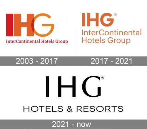
2003 – 2017

The 2003 design is, for the most part, a big acronym of the company’s name. The ‘I’ & ‘H’ use the same blocky simple style, but the ‘G’ is much thinner, wider and is actually partially inside its neighbor. The colors are red, orange & pale orange respectively. Below it all, there is the full name of the company, written in red serif letters in one line.
2017 – 2021

In 2017, the acronym letters started using the same blocky style, became slightly thinner, further apart and smaller comparably to the full name bit. That one now occupied two lines, the letters there were bigger and written with a more basic sans-serif. The coloring in both parts was pale orange.
2021 – Today
The IHG logo is an example of minimalist design with the main accent on color. Just three letters “IHG” in bold clean Futura, no excesses.
The color of the logo is orange. The previous IHG logo had a 3-tones-of-red color palette, but company decided to simplify their icon, as they wanted to refresh the corporate brand, having mobile and digital content in mind.
The IHG says, that the new simple icon will stand out more sharply in a channel that today delivers over half of all visits to their websites.
This logo change is more evolutionary than revolutionary. Being a holding company rather than a consumer brand, IHG chose the strict, simple yet eye-catching logo.


