Steven Universe is a US animated TV series about a boy who lives with magical, humanoid aliens. The series was created by Rebecca Sugar for Cartoon Network.
All the versions of the Steven Universe logo so far have revolved around the name of the protagonist.
Meaning and history
The origins of the project can be traced back to 2011. Curtis Lelash, who was Cartoon Network vice-president of comedy animation back then, consulted with the employees about possible ideas for a new series. Rebecca Sugar, one of the artists busy in the CN’s series Adventure Time, suggested a story that would eventually become Steven Universe.
When the company commissioned the series, Sugar became the first woman to author a show independently for CN.
2012
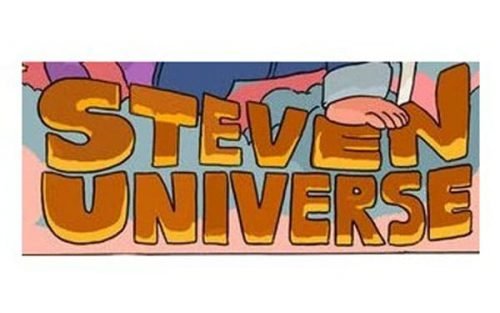
The earliest well-known version of the logo showcased the name of the main character, Steven Universe, in yellow and brown. The hand-drawn letters did not have serifs. They looked plump and friendly, although their ends weren’t rounded.
The majority of the surface was of a light brownish shade, while the border was dark brown. There were also multiple yellow highlights, which added some dimension.
The upper border of the letter was slightly concave to merge with the picture above (there, the character stood leaning on the wordmark).
2013 (pilot and pre-pilot versions)
The fleshy letters seem to have been inspired by the 2012 version.
In the pre-pilot logo, there was a stylized roundel between the two lines forming the wordmark. To fit the roundel, both the words of the wordmark were slightly arched. Also, each of the letters was colored in a different color.
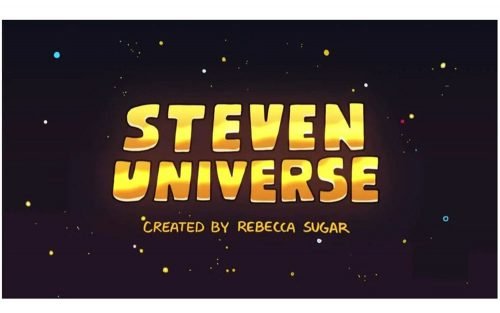
In the logo created for the pilot version, the letters had a smoother shape and palette. They were slightly tilted backward, which added some depth.
The glyphs were colored in various shades of yellow, brown, and orange, which supported the 3D effect.
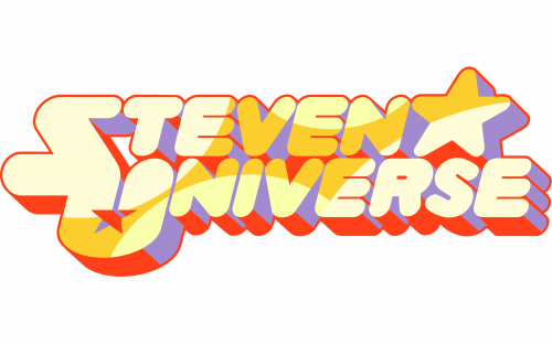
2013 — 2019
The designers who worked on the wordmark opted for even smoother letters. They were as plump as their predecessor and also got rounded ends, which is typically used to convey friendliness.
They were now tilted to the right, which created an illusion of motion. This illusion was supported by the shape of the shades.
For the first time, the initial letters in the Steven Universe logo were capitalized. The “S” and “U” merged at one point, which resulted in an intricate glyph. Also, the two stars appeared. The larger one was placed in the top right corner, while the smaller one was placed over the letter “U.”


