Good Housekeeping is a renowned magazine that focuses on family, health, recipes, and home. Created by Clark W. Bryan in Holyoke, Massachusetts, USA, it initially aimed to provide advice on running a household. The magazine quickly became a trusted source for product testing, recipes, and lifestyle tips, embodying a commitment to improving the domestic lives of its readers. Its legacy includes the Good Housekeeping Seal, a symbol of quality assurance for consumer products.
Meaning and history
Founded in 1885 by Clark W. Bryan in Massachusetts, Good Housekeeping magazine embarked on a mission to enhance household management. It quickly became a cornerstone for home economics, blending advice with advocacy. The introduction of the Good Housekeeping Institute in 1900 marked a pioneering step towards consumer protection, offering rigorous product evaluations. This led to the iconic Good Housekeeping Seal, a coveted endorsement reflecting trust and quality. Throughout the 20th century, the magazine expanded its focus to include health, nutrition, and family, resonating with readers worldwide. It also embraced digital evolution, maintaining its relevance in the digital age.
Through decades, Good Housekeeping has stood as a beacon of reliability, adapting to changing societal norms while upholding its commitment to improving domestic life.
What is Good Housekeeping?
Good Housekeeping stands as a multifaceted magazine and household name, renowned for its dedication to quality and consumer advocacy since 1885. It spans a broad spectrum of topics, from innovative home management strategies and nutritious recipes to health and lifestyle, all underpinned by the rigorous testing of products at its famed Good Housekeeping Institute.
Before 2012
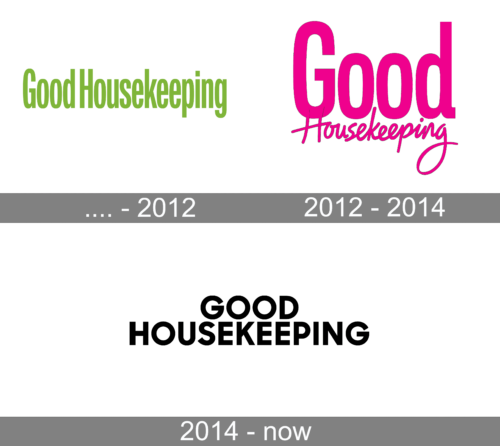
The logo displays the name “Good Housekeeping” in a vibrant, leaf-green hue, imparting a sense of freshness and vitality. The typeface is sans-serif, modern, and clean, with a soft, approachable roundness to the characters, suggestive of friendliness and reliability.
2012 – 2014
This incarnation of the Good Housekeeping logo bursts with a vivid magenta tone, signaling a bold, contemporary energy. The font presents a playful twist, combining a stout, sans-serif for “Good” with a fluid, cursive for “Housekeeping,” reflecting a blend of modernity and tradition. The contrast in styles between the two words suggests a dynamic balance of efficiency and elegance, encapsulating the magazine’s evolution to stay current while maintaining its classic essence.
2014 – Today
The logo transitions to a stark black and white, casting aside the playful magenta for a classic, timeless look. The typeface is bold and all-caps, with a uniform, impactful sans-serif font that exudes strength and straightforwardness. This monochromatic scheme and uniformity in font size across both words project a refined simplicity and a return to the roots of tradition and dependability.


