Yu-Gi-Oh is a Japanese multimedia franchise that revolves around a trading card game. Created by Kazuki Takahashi, it originated in Japan. The series, which began as a manga, quickly expanded into anime, video games, and a globally popular card game. It’s designed for entertainment, offering players strategic battles that involve magical creatures, spells, and traps. Yu-Gi-Oh’s lore is rich, featuring narratives of friendship, rivalry, and adventure, set in both fantastical and realistic settings.
Meaning and history
Yu-Gi-Oh, an iconic Japanese creation, sprouted from the imaginative mind of Kazuki Takahashi and made its first appearance in Shueisha’s “Weekly Shōnen Jump” magazine in 1996. Initially conceived as a narrative blending elements of ancient Egyptian mysticism, gaming, and modern-day high school drama, the manga quickly captivated readers with its unique concept of “Duel Monsters” – a card game with roots in a fictional version of ancient Egyptian magic battles. The franchise’s meteoric rise in popularity led to an expansive universe, including animated TV series, movies, a vast array of merchandise, and the real-world adaptation of the Duel Monsters game, which evolved into a global phenomenon.
This card game, known for its strategic depth, has hosted numerous international tournaments, fostering a dedicated community. Yu-Gi-Oh’s story of friendship, challenge, and adventure, intertwined with the strategic gameplay of Duel Monsters, resonates with fans worldwide, securing its place in the pantheon of enduring global pop culture.
What is Yu-Gi-Oh?
Yu-Gi-Oh unfolds as a captivating blend of myth and modernity, where strategic card duels unlock a universe teeming with ancient magic and contemporary camaraderie. Born from Kazuki Takahashi’s vision, it bridges the realms of manga, anime, and gaming, inviting enthusiasts into a world where strategic battles go beyond mere play, weaving tales of friendship, rivalry, and the timeless quest for mastery.
2001 – 2006
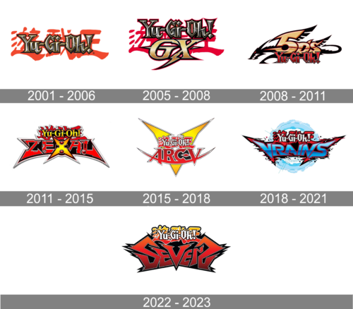
The logo of Yu-Gi-Oh exudes a dynamic fusion of tradition and modernity, encapsulated in sharp gothic lettering crowned with a regal touch. Splashes of crimson evoke a sense of action, while the metallic sheen reflects a futuristic allure. The exclamation punctuates the brand’s energetic essence, inviting onlookers into a world of thrilling duels.
2005 – 2008
This evolved Yu-Gi-Oh logo marries electric vigor with a bolt-like “GX” addition, signaling a new chapter in the saga. The “GX” element, infused with a golden gradient and a strike of lightning, introduces a fresh narrative energy. The background’s red splatter remains, preserving the essence of the original, yet the new typography suggests a sleeker, more adrenaline-fueled adventure ahead. The design’s evolution captures the essence of an advancing storyline, beckoning enthusiasts to a revitalized duel domain.
2008 – 2011
In this iteration, the Yu-Gi-Oh logo surges forward with “5D’s” etched in a futuristic font, hinting at high-velocity themes. The design forges ahead with sharp, wing-like motifs, suggesting speed and a sleeker edge, mirroring the series’ leap into a fast-paced era. The “Yu-Gi-Oh” lettering retains its familiar sharpness but is streamlined, echoing a narrative progression. Overall, the logo’s transformation reflects a shift towards a more cutting-edge and adrenaline-infused dimension of the franchise.
2011 – 2015
The logo now bursts with a star-shaped backdrop, amplifying the “ZEXAL” series’ interstellar theme. “Yu-Gi-Oh” ascends atop, its letters enflamed, signifying intense action, while “ZEXAL” anchors itself in bold, block-like characters, outlined by sharp edges that convey a cosmic adventure. This graphic metamorphosis suggests a leap into a more vibrant and otherworldly dimension, befitting the series’ evolution into new territories of dueling and storytelling.
2015 – 2018
The Yu-Gi-Oh logo sharpens its edge with a bright, yellow starburst, showcasing the “ARC-V” series’ vibrant energy. The “Yu-Gi-Oh” script maintains its classic fiery overlay but simplifies, allowing “ARC-V” to dominate with bold, angular lettering. This design radiates a leap into a cutting-edge and electrifying narrative, as the franchise continues to evolve its visual identity, mirroring the series’ ongoing innovation and dynamism.
2018 – 2021
The “Yu-Gi-Oh! VRAINS” logo pulses with digital flair, signaling the series’ dive into a cyber-themed narrative. The background’s blue digital sphere and pixelated accents underscore a virtual realm central to “VRAINS”. The typography of “Yu-Gi-Oh” remains consistent in style, but “VRAINS” stands out with its sleek, streamlined letters that seem to cut through cyberspace, hinting at the high-tech duels and virtual vistas that define this series installment.
2021 – 2023
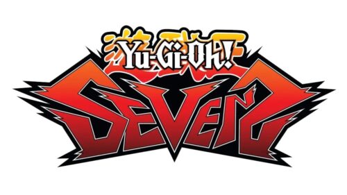
The “Yu-Gi-Oh SEVENS” logo erupts with a bold, red-hot angularity, signaling an intense, action-packed turn for the franchise. The “SEVENS” typography slashes across the design with jagged edges, reminiscent of lightning bolts, suggesting high energy and a breakneck pace. This visual shift, with its pronounced spikes and dark outline, conveys a leap into a more dynamic and perhaps more aggressive chapter of the Yu-Gi-Oh saga.


