

![]() Cartoon Network Logo PNG
Cartoon Network Logo PNG
Cartoon Network is a Warner Bros TV channel, which was established in 1992 in the United States. The channel is focused on animated series and cartoons for children, including such popular TV shows as Ben 10, Ninjago, Peppa Pig, and The Flinstones. During the daytime, the main audience of the channel consists of kids from 7 to 15, and overnight it shows animations for adults in its Adult Swim block.
Meaning and history
![]()
The visual identity of one of the world’s most famous cartoon channels is minimalist and stylish. The logo was created in 1992 and got only shorter by today, keeping the original style and a black and white color palette. It is a perfect color combination for accompanying colorful animations of different genres.
1991
![]()
The original Cartoon Network logo, designed in 1991, has only stayed with the company for several months. It was a contoured white rounded with the contoured uppercase inscription in a bold serif font, written along the perimeter of the wide frame of the roundel.
1992 – 2004
![]()
The original logo of the channel was designed in 1992 by Corey McPherson Nash. It was a horizontally located rectangle with a black and white checkered pattern, having a bold sans-serif letter in each square. The white letters were placed on the black squares, while the black ones — on white.
The logo instantly became recognizable and synonymous with high-quality animated content, making the brand stand out in the list of the competitors.
The wordmark of the original logo was written in all capitals of a bold and modern sans-serif, which is very similar to Eagle font with its strong lines and sharp angles.
2004 – 2010
![]()
The logo was redesigned in 2004 by in-house designers, collaborating with Animal Logic Studio, based in Sydney. The bright and massive emblem was replaced by two overlapping squares, with a gray shadow. The left square was black and features a white “C” on it, while the right white square had a black “N” on. The “Cartoon Network” wordmark in all capitals was located under the emblem.
The color palette and the typeface of the logo replicated the previous one, without any dramatic changes.
2010 – Today
![]()
In 2010 the team of in-house designers created a new logo in collaboration with Brand New School bureau. It is a simplified flat version of the previous logo, but with two squares standing in one line. There is still a black square with a white extra-bold “C”, and a black “N” placed on a white background. The full name of the company is written under the emblem in black capital letters, still using the same Eagle font from the original version.
In the same year, the channel launched a new slogan. “Check it” is not only about the animated content, but also a description of the checkered pattern of the visual identity.
The 2010 symbol
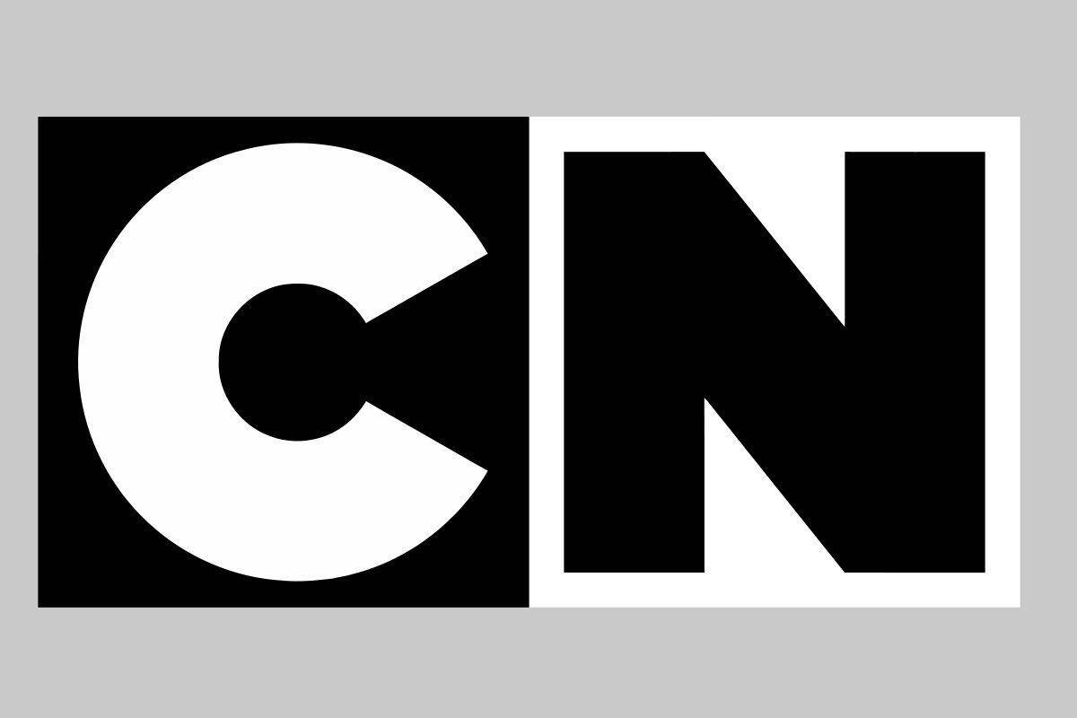
This version borrows its predecessor’s cubes motif, while eliminating the 3D effect. Now, the Cartoon Network logo is flat and features the white “C” and the black “N” inside a black cube and a white cube respectively. The shape of the letters has been heavily modified, while the typeface featured on the company name below has stayed the same.
Shape
![]()
The current Cartoon Network logo was introduced in 2004, and it featured two 3D cubes with the CN initials written on them. There is the company name written in the typeface borrowed from the previous logo version just below the cubes. This logo is a product of Animal Logic, a renowned visual effect designer company from Australia. This is just another case to say that simplicity and minimalism make right in business.
Colors
![]()
The Cartoon Network logo comes in the eternal combination of black and white. Black symbolizes prestige, excellence, determination, and courage. White expresses purity, kindness, and positive mood.
Font
The initials and company name are written in its playful signature custom typeface, which has been there since the company’s inception.
![]()
![]()
What type of logo is the Cartoon Network badge?
The Cartoon Network logo belongs to the combination logo style, which means it has both the graphical elements and the wordmark in it. In the case of this particular badge, the graphical part is also based on the lettering, but stylized and exaggerated.


