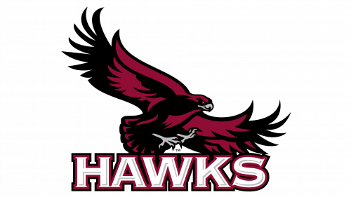
The athletic logo of Saint Joseph’s University of Philadelphia, Pennsylvania, was inspired by the name of the athletic program, the St. Joseph’s Hawks.
Meaning and history
St. Joseph’s Hawks, more than a mere athletic designation, epitomizes the spirit and ambition of Saint Joseph’s University, a Jesuit institution established in 1851 in Philadelphia. This identity is deeply rooted in the university’s ethos, embodying its athletic vigor and academic aspirations.
Central to the Hawks’ legacy is their storied men’s basketball team, which vaulted into the limelight with a spectacular journey to the NCAA Tournament’s Final Four in 1961. This achievement etched the Hawks into the annals of collegiate sports history, showcasing their prowess on the national stage. Beyond basketball, the Hawks have nurtured a culture of excellence across various sports, consistently demonstrating resilience and sportsmanship.
In the contemporary sporting landscape, St. Joseph’s Hawks maintain their competitive edge, especially in basketball, within the Atlantic 10 Conference. This ongoing pursuit of athletic excellence mirrors the university’s dedication to fostering a holistic educational environment, blending physical vigor with intellectual growth.
What is St. Joseph’s Hawks?
The term St. Joseph’s Hawks represents the dynamic and spirited athletic teams of Saint Joseph’s University, with a notable emphasis on their celebrated men’s basketball squad. As members of the NCAA’s Atlantic 10 Conference, these teams exemplify a blend of athletic tenacity and academic integrity.
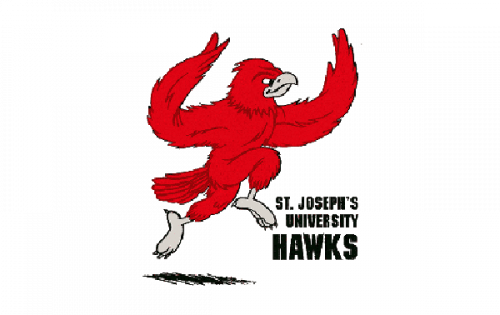
1977 – 2000
Since 1977, a red hawk has been the only character of the St. Joseph’s Hawks logo. On the old logo, it had a rather cartoonish look. While it was supposed to represent a player, in fact, it looked more like a dancer. There was something funny about him, which was not a good thing for a sports logo.
2001 – Today
The 2001 version looks by far more refined and fierce. This time, the creature is given in a darker shade of red with white black and grey nuances.
St. Joseph’s Hawks Colors
CRIMSON
PANTONE: PMS 201 C
HEX COLOR: #9E1B32;
RGB: (161, 31, 53)
CMYK: (0, 100, 63, 29)
GRAY
PANTONE: PMS COOL GRAY 11
HEX COLOR: #6C6F70;
RGB: (83, 86, 91)
CMYK: (0, 2, 0, 63)


