Charlotte 49ers is the name of an athletic program from the University of North Carolina at Charlotte, which was established in 1946. The University is also known as simply Charlotte. The Charlotte athletic program is composed of 18 men’s and women’s teams, which play in Division I of the National Collegiate Athletic Association, and its Football Subdivision.
Meaning and history
Apart from playing in the first division of the NCAA, Charlotte 49ers teams are also members of the Conference USA, an intercollegiate athletic organization, which was established in 1995, and affiliated with Division I of the NCAA. The conference consists of 14 college-members, and has 20 various sports fielded. The Charlotte 49ers football club plays in Division I of FSC. Before joining the Conference USA, the athletic program of Charlotte University was a part of the Atlantic 10 Conference.
What are Charlotte 49ers?
Charlotte 49ers are the collegiate athletic program of the University of North Carolina at Charlotte, which consists of nine men’s and nine women’s teams, competing in various sports disciplines, including indoor and outdoor Track and Field, Basketball, Baseball, Cross Country, and others.
In terms of visual identity, Charlotte 49ers is one of the most consistent and loyal collegiate athletic programs in the USA, as they still use the logo, designed for its teams at the beginning of the 1920s. No experiments, no color alternations, and no font shift. The badge is kept completely untouched, and it shows the values of the 49ers, and their ability to stay loyal to its roots and background.
1920 — Today
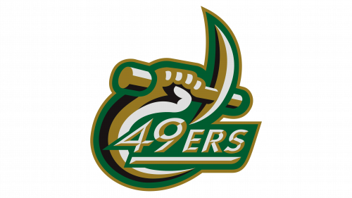
The Charlotte 49ers logo, created in 1920, is based on the image of Norm the Niner mascot, which is also a great representation of the miner specialization of the region the university is located in.
The badge; executed in a green and gold color palette with thick and smooth white accents all over, is composed of a graphical emblem placed above the stylized “49ers” inscription in a bold italicized sans-serif typeface with full-sized and even slightly extended contours of the letters. The logotype is set in white and gold, and underlined by a thick bar, horizontally divided into white and gold halves too.
As for the graphical part of the logo, it is a miner’s hand with a line arched pick in his hand. The tool with its ends curved and sharpened represents the gold-mining history and legacy of North Carolina. If the blade part of the pick makes up an upper part of the circular frame, the miner’s hand with its line curved to the center, created the second half of the circle, framing the logo from the bottom left part.


