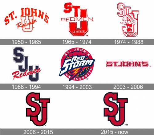
The 16 varsity teams competing at St. John’s University in the U.S. state of New York share the same name and logotype.
Meaning and history
Tracing its origins back to St. John’s University, founded in 1870, St. John’s Red Storm emerged as a formidable force in college athletics. This athletic entity was born from the university’s spirit and commitment to sports excellence, marking its inception alongside the university’s own historical journey.
Throughout its storied history, St. John’s Red Storm has etched its name in the annals of college sports, particularly in basketball. Their journey is marked by remarkable feats, such as multiple appearances in the NCAA basketball tournaments, standing as a testament to their enduring prowess and strategic gameplay. Notably, their 1985 NCAA Tournament journey remains a highlight, showcasing their peak performance. The men’s soccer team also brought laurels, clinching the NCAA Championship in 1996, further solidifying St. John’s reputation in collegiate sports.
Presently, St. John’s Red Storm continues to be a prominent player in the collegiate athletic arena. With a focus on nurturing athletic talent and fostering competitive excellence, they remain a beacon in basketball and soccer, continuously striving to uphold and enrich their distinguished legacy in sports.
What is St John’s Red Storm?
St John’s Red Storm is the name of the collegiate athletic program of St John’s University, which is located in New York. The program consists of 16 men’s and women’s teams in various sports disciplines, including Baseball, Basketball, Golf, and others, with the St John’s basketball men’s club as the most successful.
1950 – 1965
 Since 1950, the St. John’s Red Storm logo has been modified around six times. The first emblem in this succession featured a large white “U” with orange trim and the lettering “ST. John’s” arched above it. The word “Redmen” (the old name of the program) was written across the “U.”
1965 – 1974
The St John’s Red Storm logo, created in 1965, was a modernized version of the emblem, designed in 1950. Though how the Ted became the main color of the composition, with the letter “U” enlarged and emboldened, and the “Redmen” in the uppercase crossing it in the middle. The “St” part of the logotype was placed on the upper left corner of the emblem, with the letters placed slightly diagonally from the upper left to the bottom right corner of the composition.
1974 – 1988
This design is actually very similar to its direct predecessor. However, they turned the imagery white and red (for edges, mostly), got rid of the ‘Redmen’ bit and placed an image of a Native American inside the letter ‘J’. The small nuance includes a bit of depth in these letters, as well a now-curved name in the bottom of ‘J’.
1988 – 1994
The redesign of 1980 created a modern and bright badge, which was simpler yet stronger than the previous one. The three letters “SJU” were written in the uppercase of a medium-weight geometric sans-serif typeface and set diagonally from the upper left to the bottom right corners of the badge. The red “Redmen” in sleek and thick cursive was written over the bottom part of the emblem, crossing “U” and touching “J”.
1994 – 2003
 The 1994 emblem showcased a lightning bolt.
2003 – 2006
 In 2003, it was replaced by the simple lettering “St. John’s” in red.
2006 – 2015

In 2006, only the letters “S” and “J” were left.
2015 – Today
The letters were just barely lightened in 2015.
St. John’s Red Storm Colors
ST. JOHN’S RED
PANTONE: PMS 200 C
HEX COLOR: #BA0C2F;
RGB: (186, 12, 47)
CMYK: (3, 100, 70, 12)
SJU BLUE
PANTONE: PMS 296 C
HEX COLOR: #041C2C;
RGB: (4, 28, 44)
CMYK: (100, 73, 28, 86)
SILVER GRAY
PANTONE: PMS COOL GRAY 6
HEX COLOR: #A7A8AA;
RGB: (167, 168, 170)
CMYK: (16, 11, 11, 27)
WHITE
HEX COLOR: #FFFFFF
RGB: (255, 255, 255)
CMYK: (0, 0, 0, 0)


